
 |
| Despite the game saying that the quest is to clear the levels "without getting killed," the game does not feature permadeath. |
Dungeon Quest
United StatesDungeon Quest is one of a host of early-1990s shareware RPGs for which, thirty years later, we have only the demo program. Like many other games of this description, we cannot even be sure that the full version was ever finished and released.
In the case of Dungeon Quest, that's probably a good thing. The demo version, labeled "Test Drive," confines the player to the first level only and lacks any sound effects. One level is more than enough. The game and its mechanics are competently programmed, but there's nothing to do but fight monsters, and I lost interest in that well before the end of the first 50 x 50 level.
 |
| Confronting a ghost. |
The game--or the demo version, at least--gives you no backstory except that your mission is to completely clear the 8-level dungeon of monsters. You can choose from paladin, fighter, and mage classes and dwarf, elf, halfling, and human races. You set your sex and roll for the standard set of Dungeons & Dragons attributes, and the game begins in the northwest corner of the large dungeon. The positions of monsters and items are randomized for each new game. The game's primary influence seems to be Dungeon Master. Although movement is based on tiles, combat happens in real-time, with a brief "cool down" between attacks and spells.
 |
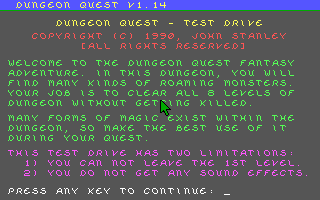
| Character creation breaks no new ground. |
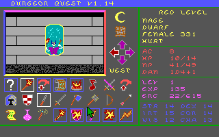
The interface shows all the game actions on a panel of 24 icons. The middle row shows the specific weapons that you might ready (dagger, sword, axe, mace, bow). The right side of the bottom row has the game's five spells: "Mage Light," "Fire Shield," "Flame Dagger," "Fireball," and "Lightning Bolt." All characters can cast spells, but fighters get the fewest spell points and mages get the most.
Much of the game is well-programmed. The textures, monster graphics, and spell animations are more than acceptable. The automap works better than 90% of commercial games of the era. One nice feature is that it maps everything you see, not just where you walk, so you don't have to walk down every dead-end corridor just to complete the map. Although there are a lot of options in the rows of icons, the game clearly outlines the ones you can currently use. And it does a cute thing with the numerous mirrors that you find in the corridors. Every time you turn and face one, you get a different image of something horrible happening to your character (even if it doesn't reflect reality)--and the character you see changes depending on your race and class.
 |
| The skeleton seems angry. |
There are some exceptions, however. I didn't like having to click on the icons to activate them. Technically, the F1-F8 keys activate the first row; SHIFT F1-F8 the second, and ALT F1-F8 the third. That just replaces clicking with counting. None of the other keys are used except SPACE to bring up the automap. Why not map attack to "A," Fireball to "F", camping to "C," and so forth?
 |
| My character sees a skeletonized version of himself in the mirror. |
The more egregious programming failure is that enemies can only attack you if you're looking at them. If you turn away, you can collect yourself as long as you need to or even sleep. Enemies also can't move from their starting positions, so unless they have a ranged attack, you can pelt them from a few squares away with impunity.
 |
| Sending a lightning bolt towards a hydra. |
This is only one of several ways in which the game is fundamentally too easy. On its surface, this is supposed to be a game about carefully managing resources--conserving items, using the right spell on the right enemy, and so forth. In practice, you find so many Wands of Fire, Wands of Lightning, Potions of Healing, Potions of Magic Restoration, and other useful items, that there's no reason not just to blast away with "Lightning Bolt." I ended the level overflowing with gear. You also find armor, shields, and weapon upgrades, but my paladin hardly ever fought in melee combat. He had too many spell points and spell items.
Leveling up is also insanely fast. I ended the level at character Level 46.
 |
| My character kills the level's final enemy . . . |
If it isn't going to be hard, a game at least needs to be interesting, but here again Dungeon Quest fails. There are no challenges, riddles, puzzles (mechanical or otherwise), notes, dialogues, bits of backstory, or even interesting patterns in the walls. There are just dozens of featureless corridors teeming with bats, skeletons, green slimes, gargoyles, giant snakes, giant plants, ghosts, and hydras.
 |
| . . . and maps the final square of the level. |
Nothing happened when I killed the last enemy or mapped the last square. I never saw any stairways on the map. I'm going to assume that the full game is seven more levels of the same thing. The author was a John Stanley of Seattle, long since moved from the location to which we are instructed to send our shareware fees. I have some messages out to possible e-mail addresses, but let's otherwise not pull out all the stops trying to find a full version.
The graphics are a bit... rough, but I notice that it uses the Dungeon Master aspect ratio (roughly the golden ratio), and the DM camera position with the camera roughly 3/4 from the floor to the roof. Wizardry and friends had the camera in the center, and the walls were square, which ends up looking a lot less natural.
ReplyDeleteSome good decisions there, though it may just be a matter of taking influence from the right source.
"so you don't have to walk down every dead-end corridor just to complete the map."
ReplyDeleteB-b-but that's where the most interesting encounters usually are. Just imagine what you can potentially miss by not walking down the whole corridor? How can you even sleep at night not knowing?
This is the kind of game where you can see all enemies and objects in their squares. You can see 4 squares ahead of you. If they show nothing, there's nothing there.
Delete"The textures, monster graphics, and spell animations are more than acceptable."
ReplyDeleteLOL, they're not. I understand we're operating from completely different vantage points regarding graphical presentation though.
I mean, you can see what the sprites are supposed to represent. That makes them acceptable by default!
DeleteDude, he called the *more* than acceptable, and that's only valid when compared to 'Wizardry's' wireframe dungeons.
DeleteI stand by the statement. The graphics of Dungeon Master don't do anything additional for me. They depict what they claim to depict and they don't cause any confusion. Sure, they're a bit amateur, but they're not completely laughable like we've often seen in shareware titles.
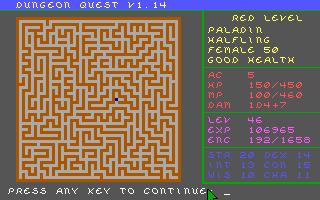
DeleteThat automap screenshot shows that you really need ROOMS to break up the monotony of worm tunnels. It's nice when a Dungeon Master-style occasionally gives you space to waltz. Maybe the designer learned their value in the speculative full version.
ReplyDeleteReally was expecting more imagination from a game called Dungeon Quest.
ReplyDeleteThe thing that jumps out at me with this one is the graphical style.
ReplyDeleteIt doesn't feel like a PC-oriented design.
It's like someone took a design aimed at one of the 1980s 8-bit home micros and upgraded (for certain values of "upgraded") the colours.
I love colour schemes so you may want to pull up a chair for this one.
DeleteYeah, it's one of those games that continued to use EGA and the default palette, which had better support across multiple graphics cards than the option of picking the other 48 colours that an EGA card "should" be able to display. It also worked really well for porting the game to computers such as the Atari ST and Amiga, as seen with the Gold Box games, because the graphics will directly port to those computers without needing colour reduction or other changes. The EGA look would also prove to be a boon for the unreleased handheld Atari Lynx port of Eye of the Beholder.
Some games, such as Gold Box and Commander Keen 4 the next year after this would make the graphics at least have convincing depth and detail even with this palette, but yeah bad palettes such as this and the 4-colour CGA ones don't aid the artist. It can be really hard to stick out graphically when you don't even have the luxury of picking your own colours to set the mood.
Though that's not to say that all VGA or Atari ST/Amiga-exclusive games look good - they can get very stuck on the "realistic" grey or brown look that only serves to be boring, use bad colours such as the main RGB/CMY colours (lemon yellow gradients anyone), or just plain flat construction paper cutout-looking art (Moraff's Dungeons of the Unforgiven) that doesn't use the extra colour choices well to add realism, texture, or depth.
I will extend an olive branch and say that I do feel for all the amateur developers such as this guy and Moraff. Using these ugly colours or having to make a 256-colour game all on your own are both tall asks, and just because I don't like the end results doesn't mean that the authors weren't bold for trying.
There were no tools like gramaz.io/chromaticity that used Lab/JAB/JzAzBz and had any good indicators of the qualities of the colours that you were picking, such as lightness or saturation, and it was correspondingly hard to make good gradients that used 256 colours (or even 32!) well. RGB also has really ugly "primary" colours in my opinion, all 3 (or 6 if we include yellow, cyan, magenta) being highly saturated and eye-watering, almost never corresponding to any realistic object. If you want to make a good gold colour in RGB you can't just make a white-yellow-black gradient - the lemon yellow problem will rear its ugly head again. You have to carefully manipulate the red and green proportions relative to one another (a higher red proportion than green, for a start) so it's "yellow-bordering-on-orange" instead of lemon-yellow, and decrease the saturation by adding equal amounts of all 3 colours so it looks a metallic amber instead of marigold - and make sure to keep these proportions the same for the lighter and darker colours.
All this math to do as a single developer before you've even gotten to actually DRAWING the stupid gold coins! Pixel art is a lot harder today than most give it credit for, but it was ESPECIALLY so back in the eras in which it was most relevant. For every "ugly" or "bad-sounding/soundless" game from way back when, I have to remind myself how hard it was to even get them to the states that they were in - especially for games belonging to smaller developers such as this one and whose games didn't cost as much, deserving higher leniency.
Everything being upper-case also makes this look like the game was originally written for a not-PC, like Wizardry I or Pool of Radiance.
DeleteIt definitely looks like it was designed for a legacy computer system. That tiny viewport, the overly-ornate all-caps font, the stark colors, even that off-black background.
DeleteBut it was released in 1990. maybe they were really leaning into a nostalgic early 1980's look? I feel like people weren't quite all that nostalgic for it, yet.
320x200 was the standard resolution for PC games in 1990, and would remain so for a couple more years to come. VGA graphics (i.e. 256 colors instead of 16) existed in 1990 but were not exactly the common standard yet. So yeah, it makes sense for a 1990 game, especially an amateur one, to be 320x200 in 16 colors. That's not nostalgia, that's a common albeit non-cutting-edge PC from that time.
DeleteI'm not saying that EGA would be anachronistic at all, but the style is. I played many games of that era in EGA, but this game evokes early home computing in many ways.
DeleteI love the graphics. There is something I came to appreciate more and more which is games that make it very easy to tell what objects are what, which is an interactive one, which is a background one, and the shape of them all. There are people who think that this is not realistic, but give me all gamey colours for a game, please. Yeah, that is my whole comment.
ReplyDeleteThe graphics are very clear. I get the impression they are drawn by an amateur in MS Paint, but nevertheless by someone who understands interface design well.
DeleteAs a fan of FPS games, I really appreciate oldschool 3D graphics like Quake 1, Unreal 1, Half Life 1, etc. They're usually very clear and easy to read.
DeleteModern 3D graphics often overuse special effects to the point that the environment becomes hard to read and you end up not spotting enemies in situations where one second can decide over life and death.
You might think these shareware rpgs are all terrible... but you're only 1 year away from exile, a shareware rpg that might actually go on your top rpgs list
ReplyDeleteI've not played Exile, but I played through both its remakes. I think Avernum comfortably tops the gimlet, but how much did Avernum improve on the original? Should you play Exile with the full party of 6, or is it better with 4?
DeleteI've played the original Exile trilogy and the first set of Avernum remakes.
ReplyDeleteThere is definitely a difference in the number of monsters in the random combats, where it was intentionally balanced towards a larger party. They also had a wider range of skills and abilities to cover, making it harder to cover everything with fewer.
That said, it was considered an ironman challenge to try and get through the game with only 2 characters; they will level up much faster but inventory space becomes a much bigger limitation.