 |
The graphics on the title screen change every time you launch the game. That's a fun touch.
|
Dungeons of the Unforgiven
United States
Moraffware (developer and publisher)
Released 1993 for DOS
Date Started: 10 January 2023
Dungeons of the Unforgiven is Steve Moraff's follow-up to
Moraff's World (1991), which itself was an update of
Moraff's Revenge (1988). So far, the changes between
World and
Unforgiven seem lesser than those between
Revenge and
World, but they're mostly positive. Gone are the pointless outdoor areas with their confusing "fractal landscapes." The game still insists on showing views in all four directions (a momentarily interesting approach that ultimately does nothing for gameplay), but it at least emphasizes the forward-facing view, and movement with the arrow keys is handled more intuitively than in
World. I'll discuss more differences as we move forward.
 |
Exploring a dungeon of the unforgiven.
|
(Almost every web site has this game as Moraff's Dungeons of the Unforgiven, but the title screen does not include the author's name. My general policy is to go with the most common two out of three between the title screen, the manual, and the box, but in this case, the game has no manual or box.)
Perhaps the most important set of improvements are graphical. (Logan Gilbert replaced Rodney Page in the "artwork" department.) As you launch the game, you get to choose from 13 different video modes, the options combining resolutions (320 x 200 up to 1024 x 768), colors (2 to 256), and adapters (CGS, EGA, VGA, SVGA, XGA, and one I've never even heard of: Ultra High-Res VGA). Many of these have more than half a dozen sub-options. I'm curious why so few other games offer so many options even when they have manifestly beautiful graphics. Did they all auto-detect the graphics card? The higher levels are well-used in the game; although the graphics retain a certain amateurish look, none of them are quite as goofy as in World. (I mean this in terms of graphic style; many of the monsters themselves are undeniably goofy.)
 |
Fighting a decently-drawn enemy. Here, I have the background set to black-and-white wireframes to improve movement speed.
|
Unforgiven offers more mouse support than its predecessor. You could, in fact, play it entirely with the mouse, clicking on the various windows and commands. Having had enough of that in The Mystic Well, I appreciated the option to turn it off and just use the keyboard.
One of the more pointless changes is in character creation. Where World had standard fantasy races, Unforgiven changes them to humanoid, ape, childman, rodent, hobo, giant, widget, and shrimp. I don't have any problem with unusual races in CRPGs. Sometimes, they're a refreshing change from the standard elves and dwarves and whatnot. But if you're going to create races like "hobo," "widget," and "shrimp," you've got to describe them. You've got to add some lore to your setting to give them descriptions and histories. Here, they just become sets of average statistics.
 |
You have to wonder how someone that intelligent, wise, and lucky ends up a hobo.
|
Attributes are strength, intelligence, wisdom, constitution, agility, and luck. Class choices haven't changed since World, and they are relatively well described in-game: fighters, worshippers, monks, wizards, priests, sages, and mages. One of the things I liked about World, and like here, is that the class choice really does make a difference. A player who chooses a fighter, who relies on finding good weapons and armor, faces a very different game than one who chooses a monk, who cannot use either. Sages compensate for poor combat ability by finding more loot. Monks start with all spells but have lower casting power than the classes that have to find them. I don't know how well the various classes work in practice, but they sound good on paper. That said, they're also manifestly based on Wizardry, with the name changes (e.g., sage=rogue, mage=samurai, priest=lord) creating more confusion than necessary.
 |
At least the classes are described.
|
Somewhere during setup, you choose a difficulty setting--"Normal" or "I
Can Handle Anything." Supposedly, the former setting gives you access to
only four modules where the latter includes a fifth, for "tough as
nails, gritty players, who come from the streets with nothing." Being a
somewhat soft, refined player who grew up in relative privilege, I chose
"Normal."
I went with the game's recommendation and chose a giant mage for my first character. After character creation, the game dumps you naked on the top level of a
dungeon, with a mission to "explore vast dungeons and defeat evil
monsters." The help menu--needlessly couched in the form of a little snake that rushes up to give you advice--has some more information about the backstory. The dungeons are on "Moraff's World," which is "somewhere near an old planet named Eart." Eart was consumed by race wars between human and non-human creatures, which led to the segregation of said creatures in the form of level groupings in the current dungeons. No one knows if the dungeons are in a planet or in a spaceship--no one has seen the outdoors in recorded memory. This is one of the few backstories for which reading it leaves you worse off than if you'd just imagined something.
 |
The incomprehensible backstory.
|
The interface is highly customizable. The default shows you views in four directions with the forward-facing direction emphasized. All available commands are in the upper-left and called with a single key. The upper-right has an automap; the lower left the character sheet. Combat and messages appear in the lower-right. But the G)raphics menu allows you to change this screen in a number of ways. There's a three-way toggle for regular graphics, reduced graphics that show colors but not textures, and black-and-white wireframes. This would have been useful to contemporary players because the default graphics take a couple of seconds to load after each step or turn and would swiftly become annoying without the ability to increase the CPU speed. There are other options that reconfigure the interface to show less information and more of the game world, including an option to only show the front-facing view in a full screen.
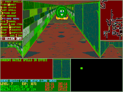 |
An approaching enemy in normal view . . .
|
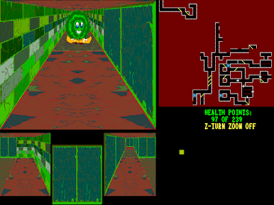 |
. . . a "zoomed" view . . .
|
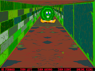 |
. . . and a full-screen view.
|
The automap deserves special praise. It shows not only where you've been, but anything you've seen, and it marks ladders, doors, secret doors, and chutes. On the town level, it annotates shops using different colors.
 |
An expanded map of the town level.
|
Moraff thus spent a lot of time on the interface. I wish he had spent as much time on content. The key problem with Moraff's World remains present here: nothing really happens as you explore the dungeons. The levels are enormous, but why? There's almost nothing to find in the twisting corridors except random encounters and ladders, of which there are so many that you hardly have to go looking for them. Unless things change on some of the lower levels, you never find treasures, NPCs, special encounters, or anything else in the dungeon, so there's hardly any reason to explore except to hunt for monsters to kill and level up.
Combat isn't that interesting, either. The fighter, who can't use spells, faces a particularly boring game, as the only physical combat options are to (F)ight or use the regular movement keys to run away. The monsters might be better drawn than in World, but they're no less goofy. In the first five levels, in addition to some nice-looking "gargalons," "Lesdidian warriors," and "harpeys," I fought giant balls, puffballs, rockets, a "druggie" with syringes for arms, and living trash cans.
 |
Killing a giant ball for U.S. dollars. Just what I like to see in a fantasy game.
|
Spellcasters have a more interesting time. I do like that you acquire spells one-by-one (except the monk) and have time to test them out. As in World, the game offers a unique spell categorization system. In addition to wizard battle spells and priest battle spells, there are "preparation" spells that must be cast outside of combat and "permanent" spells that must be cast in town and take one month to cast. "Preparation" spells include buffs but also healing and navigation spells. "Permanent" spells include "Enchant Weapon Level 1," "Enchant Wand Level 3," and "Extra 3 Health Points."
 |
This guy is oddly terrifying.
|
For combat spells, in my first few hours with the game, I acquired "Sleep," "Magic Zap," "Minor Protection," "Slow Enemies," "Strength," "Minor Shock," and "Magic Missile." Other characters are different, but my giant has so few spell points, that I'm encouraged to save spells for when I really need them, which is rare. Simply swinging a weapon is good enough for most battles, at least in the early game.
 |
Casting a spell. I haven't found many so far.
|
I began the game by visiting the town and using my limited currency to buy a short sword and chain armor. These items are sold at generic "shops," along with crystals that restore magic points when you rest, and "culture stock," a weird addition that stops you from aging when you rest. The shops sell six types of weapons, from sticks (1 ruble) to long swords (450 rubles), and six types of armor, from robes (1 ruble) to field plate (9,900 rubles).
 |
Buying my first weapon.
|
Temples let you cure wounds, poison, and disease, plus "help a child" for 100 rubles. The game tracks how many children you've helped; the statistic supposedly has an impact on how much you're charged in shops and inns. Inns let you rest for healing, spell recharging, and leveling up.
For some weird reason, when you find money on slain monsters, it's always in the form of U.S. dollars. The game wasn't terribly immersive in the first place, but that certainly doesn't help. You have to visit banks to change it to rubles. You can also deposit and withdraw money at banks. As with World, there's an option to rob them, but it doesn't actually work.
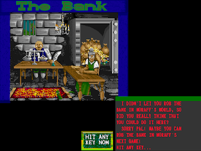 |
Moraff's "next game" was a Tetris variant, so I guess not.
|
From the town, there's not much to do but go down and start fighting. The dungeon is organized in groups of five levels, and the first five are the "Gargonian" section--"dominated by tough, evil, part human, part beast monsters which will try to defeat you!" The S)ection Info command gives you some background on the area and each of the foes you'll be facing.
 |
This monster list is notably not exhaustive and does not include some of the more goofy foes.
|
I found most of the enemies in this area easy. I never came close to losing a combat, nor did I suffer any negative effects except for experience point draining at the hands of the occasional "sustrontima." I swiftly rose to Level 7. Some notes on this experience:
- One of the more annoying features of the game is invisible chutes which dump you to the next level. Fortunately, there are copious ladders to return to the previous level, and the chutes are thereafter marked on the automap.
- Another annoying feature: doors sometimes become "jammed" after you walk through them. I haven't been able to find a way to un-jam them. If you've walked into a dead-end on the other side of the door, with no ladders, the only way to escape is to use the T)unnel command, which takes a few minutes.
 |
The door jams while I'm in a 1 x 1 square.
|
- There are teleporters scattered throughout the dungeon that take you to the other modules.
 |
I'm not quite ready for that.
|
- The game pops up with hints and quasi-tutorials frequently, reminding you to do things like visit the inn to level up.
 |
As I slay an enemy, the game offers me hints as to what to do next in the lower right.
|
- When you return to the town level after gaining enough experience to level up, the game gives you backhanded compliments, like "Hail wimp! You are no longer the weakest player in the world!" or "Congratulations! You are no longer a novice! Now you're a rank amateur!" These messages are also delivered by little snakes. I don't know what this game's deal is with little snakes.
- The otherwise-flexible interface has no options for strafing or moving backwards (the down arrow turns you around).
- In addition to money, enemies sometimes drop minor healing potions, crystals, and weapons or armor. I managed to find a long sword and a breastplate. You cannot sell excess items in the shops.
- There are trap doors that let you jump multiple levels, but you have to find the associated key.
After a few levels, little snakes started approaching me with messages from the "Shadow Gargalon" on Level 5. The messages taunted me and invited me to come challenge her. Just like World, every fifth level has a boss with the name "shadow" in front of it. Killing it offers you a special item of loot.
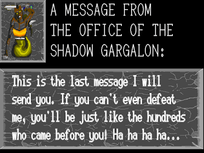 |
I feel like there's a tautology in here.
|
When I was Level 7, I decided I was strong enough to try the Shadow Gargalon. I made my way down to Level 5. When you're on a boss level, the automap tells you roughly in which direction that boss may be found. I started heading in that direction, but she soon came to me. I had difficulty hitting her in melee combat, but my "Magic Missile" spell did a fine job. The reward for killing her was a "bottle of biotech-fluid from a mythical planet." It increased my maximum health by 30. "Now seek the Shadow Elemental on Level 10," the game said.
 |
The "Shadow Gargalon" has more hit points than the regular gargalon, but it looks the same.
|
As I wrap up the first session, I'm having a problem. Inns want an escalating amount of money to let me stay there. It started at something like 5 rubles but had gone up to 2,397 by the time I was ready to make Level 9. That's more money than I've made in the entire game so far. There are dozens of inns on the town level, but they all seem to charge the same thing. I'll have to head deep into the dungeon looking for plunder if I want to afford the inn. I just have to hope my spell points and hit points hold out. The game has permadeath, so a lost character is gone for good. World had "resurrection contracts," but I haven't seen them here.
 |
Those rooms better include free wi-fi.
|
MobyGames's
summary on
Unforgiven starts with this: "
Dungeons of the Unforgiven is
Moraff's World and
Moraff's Revenge with a story." So far, I haven't really seen any evidence of this "story." It seems to me that it's going to be the same as
World: bosses every 5 levels culminating in a final boss on Level 25 or 50 or something. In fact, I believe I remember commenters arguing with the idea that
Unforgiven has a "story" in my review of
World. (There are a lot of spoilers in that comment section, so I've resisted going through it in detail.) Nonetheless, I'll try to at least "win" the first module of
Unforgiven and see if anything new is introduced during the process. I can't see sticking this out for four more after that.
Time so far: 3 hours


This is one of the most gonzo games I've ever seen and that's saying something. It's like someone made a game out of the Dr. Bronner's soap bottle. Moraff was clearly very fond of his font rendering code.
ReplyDeleteThe artist seems to take some inspiration from Might & Magic. Both the monsters and the shop graphics are very reminiscent of World of Xeen.
We're all ONE or NONE. Ape, childman, shrimp, and hobo - all ONE or NONE before we destroy LESDIDIAN'S SPACESHIP DUNGEON!!
Delete"It's like someone made a game out of the Dr. Bronner's soap bottle. Moraff was clearly very fond of his font rendering code."
Delete🤣 Gosh, I have to think the guy must have dressed in clashing plaids and stripes too. It really is a bit of an eyesore.
More developers from the era should have considered the old adage, "Less is more."
2021's Cruelty Squad by Consumer Softproducts would revive this "aesthetic" to good effect, creating a nightmare world in a bizarre FPS that demanded a lot of out of the box thinking.
DeleteI knew immediately upon glancing at the first screenshot that this was Moraffware.
ReplyDeleteI'm with our host on this one. It's just an empty world, way way too big, with dumb goofy monsters. I don't mind a big world but there better be something worth exploring. The town level is just ridiculous, why does it need to be large and have duplicates of every store? Character progression is the only motivation to play, and even that's not very fun. Even back in the BBS days I wouldn't play this game. About the only thing you can say in its favor is that it supported all those resolutions, and there were people out there salivating at the thought of displaying something in 1024x768.
By chance I was playing some of the Moraff arcade style games last week, and knew instantly DotU was Moraffware. Those visuals are so loud I can hear them. Moraff's fonts and bizarrely comprehensive set of graphics modes are all over his arcade/educational titles as well - this is a man who is very proud of his font code, or more likely nobody has ever fallen in love with the Borland Graphics Interface library as deeply as Moraff did.
DeleteYes!! This program was 100% created in either Borland Turbo Pascal or Borland Turbo C (likely the former). Back in my youth I used to play around with that library a lot and the results looked a lot like these graphics. And the supported video modes lines up perfectly with what the library has default support for. I wish the source code for old games like this was readily-accessible. My 13 year old self would be in heaven if he could see it!
Delete@King Tut = In theory it is accessible. According to one site I read a while back, said that DOTU's executable is actually a PKUNZIP compressed folder. So if you managed to get a PKUNZIP program to work in DosBox, the theory is you could "unzip" DOTU into its source files. I never personally tried, because it sounds like its a "biatch" to set it up properly in DosBox, I just don't have the time these days to do that. But if you were determined, then you could try that out.
DeleteI wholeheartedly agree that whoever designed those dungeons and UI with a consistent "radioactive green on crimson red" color scheme should not be forgiven.
ReplyDeleteSeeing those graphics makes me wanna cry, puke, and then leave the room...
DeleteImpressive automap though.
I'm totally with you, what the hell...
DeleteI kind of like the way the outlining on the monster portraits makes them stand out against the backdrop.
DeleteI can't say I've ever gotten this faux horrific outrage people have towards the game's graphics. Its fine. Actually playing it, I've never thought that something I was seeing in-game was ugly.
DeleteBefore someone accuses me of not caring about graphics, I care immensely, its just that Unforgiven isn't something I'd put in the bad pile.
That's unforgivable, Morpheus ;)
DeleteMoepheus, you're actually telling us that you don't understand that some of us here actually don't like walls etc. colored in different garish hues of green contrasted with blood red? Well, maybe the screenshots are shifting colors to the worse. Maybe you were playing it on a CRT. Otherwise all I can say is I'm stunned how different people's perceptions can be.
DeleteGo figure, not all of us were trained that colors are ugly when other colors are next to them. Some of us think for ourselves and come to our own conclusions.
Delete"When everybody's thinking the same, nobody's thinking."
-- Heinlein
Oh, I can assure you that I'm actually thinking for myself thank you very much. All I said here was not some high and mighty nonsense like quoting unrelated authors but my honest spontaneous reaction upon seeing the screenshots. Without actually caring what colors might or might not go together well since I'm the last person to be suspected being an art or design snob or something like that. It's called common sense. Might as well be there is no thing like that when it comes to colors.
DeleteOne realization as an artist is that people's perceptions and visual tastes are highly subjective. Chester himself should be an excellent window into how true that is, and how it can affect one's broader thinking about visuals. For me this is clown vomit, but I'm not surprised that others aren't bothered by it. I think I always assumed this line of games had 'programmer art', but no need for anyone to be incensed if that works for some people and doesn't work for others.
DeleteI was worried he was losing his touch, but "having a sense of aesthetics makes you a brainwashed sheeple", with a Heinlein quote no less, is classic Harland.
DeleteI've seen uglier than this. I've made uglier than this. The previous game covered by this blog (BloodNet) was uglier than this. Doesn't mean that people are faking their reactions to it. I showed screenshots from this post to three different people and the reactions ranged from "dear God that's hideous" to "what the fuck is going on there?" What motivation would any of them have to lie about their reaction? It's just silly to say so.
It is 2023 and its a safe bet people are going to exaggerate things for the sake of a joke. Especially since the characterization of the greens as garish and the red as blood-colored is completely contrary to what I'm actually seeing clearly shows some people are exaggerating. That or they're militant atheists. ;p
DeleteI appreciate how much the game's menus look like an '80s heavy metal zine. As for the rest, it's kinda like what Dungeon Master would resemble if the Screamer slices you ate early on were packed with hallucinogens. At least it's something different?
DeleteI genuinely wonder if there's a perception difference here, because to me looking at the left hand of the game screen (second screenshot) I am seeing lime green text on a blood red background. No exaggeration required.
DeleteI'd call the text lime green, but the background is a muddy red, not blood red. I don't see any lime green in the dungeon itself though.
DeleteI can assure you Morpheus that's really my perception, no exaggeration intended.
DeleteWhether you like it or not is one thing, but anyone who claims this looks relatively normal is delusional.
Delete"This is what puke would look like if someone ate radioactive slime"
Delete-- Heinlein
Folks, relax please. I like it. Not specifically for what they are, but for where they belong to: the era of raves, of shoegaze, of neon colours in parties in the middle of forests, of the CGI videos for Prodigy's "One Love" or Usura's "Open your Mind". The Art Futura years. The computer kitsch. All of those were defeated by the very very boring clerical fashion of The Matrix.
DeletePlease stop participating in this thread if you can't be nice. We're talking about subjective opinions here, adn there's nothing at stake to get worked up about.
DeleteWell, I hope you're happy, anonymous jackass. I have to moderate all comments now. GO AWAY.
DeleteIt's a certain level of success that you draw trolls, Chet, if that's any consolation.
DeleteWithout exaggeration, I swear, at first glance I was seriously offended by the graphics and knew I had to post about it. Then I saw it was Moraff and it all made sense. But, I'm still posting.
The monster graphics are surprisingly not bad, and I think the shop graphics are pretty decent. But the rest of it is bad enough that even if it was an amazing game, I couldn't play it.
if it helps, I am a professional art director for video-games and when I was a kid playing Moraff's World I thought it looked absolutely devastatingly ugly. Now I think it looks unique and devastatingly garish. It's a look! A look you won't ever forget is important.
DeleteI don't think this look is 100% a result of forethought on anyone's behalf, but it doesn't have to be to congeal into... this, evidently.
I like the thought of Carlos that the look is a product of its time meaning early 90s techno culture. This would also explain why I don't like it, I could never identify with the music and culture as a kid and now, Rock & Metal for life! ;-)
Delete"I'm curious why so few other games offer so many options even when they have manifestly beautiful graphics. Did they all auto-detect the graphics card?"
ReplyDeleteMost games of this period still made use if bitmap graphics, which by their own nature do not support scaling or change of form factor gracefully.
So they were mostly developed with a single graphic card/mode in mind and required the user's PC to support it.
Earlier games had usually more options (CGA/EGA/VGA...), but by 1993 a developer could assume most users had a card supporting VGA mode 13h (320x200 resolution at 256 colors) so that is what they usually targeted.
Even later 2D games making use of SVGA resolutions like Infinity Engine ones, Diablo or Fallout would usually give very few options in that sense.
Yep. By 1993 standards, a game was either in 256 colors or it was considered ugly and not worth it. This is kind of like in the early days of 3D graphics cards, a game was either 3D or it was considered ugly and not worth it.
DeleteOf course, making a game look good in ONE resolution is less work than making it look good in *several*, so it was an easy choice for programmers (and artists) to default to the 256 color standard.
There's also the added issue of widespread graphics APIs not being much of a thing until the mid-90s. You couldn't just use OpenGL or DirectX and be assured your game would work on most video cards, you had to specifically make your game work with a graphics card if you wanted to take advantage of better features
DeleteFor what it's worth (I have no idea about this), the website selling it stated: "Specify "Tseng Labs ET-4000" graphics card in the
DeleteDOSBox Configuration file to view the games in full SVGA".
"I could never imagine that someone would call distinguishing between chocolate cake and dog poo "thinking" - but, I guess, in retrospect it's typical for people who never did any thinking. Also, this so-called artwork is dog poo, don't know if its colors are considered good together or not, don't care about it either, it's simply dog poo."
Delete-- Heinlein
Moraff added SVGA support to this game a few months after the first release. Judging by screenshots, the game was designed for 320x200x256 and it deals with SVGA's higher resolution by scaling the sprites up. This works pretty well in first-person perspective since sprites in the distance are scaled already (and thus in SVGA, they need to be scaled LESS, and looks more crisp). Enemies right in the front will look slightly blocky in SVGA.
DeleteThere's the chicken-and-egg problem that players won't buy SVGA cards until major game studios use them, and major studios won't use SVGA cards until a large part of the market already owns them. What is nice here is that a solo designer can buy an SVGA card and be a pioneer; and indeed Moraff's DOTU is one of the earliest games that support SVGA.
In the source code, it's all actually designed at 1600x1200 (despite no cards at the time supporting that), and everything's scaled down to whatever is used (or it's vector art, like the text and UI, and drawn at the used resolution). The graphics format for the monsters and walls are mostly 256x200px, which would probably pretty closely match to their screen space when running at 640x480x256, so that's arguably what the sprite art was designed for if you just look at a sprite 1 tile away in the main viewport, however even at 1024x768 the sprites are getting scaled down in the side viewports, or if they're more than a tile away, as you mentioned. Really it was just designed for "as high res as possible and could still fit on a disk / in memory" and then scaled down to whatever was available =).
DeleteThis comment has been removed by the author.
Delete@Jimbly The source code's available? Where at?
DeleteIt's not currently publicly available anywhere, though Mr. Moraff probably wouldn't care if it were shared, I'll try to remember to ask him next time I'm in contact. I acquired some partial source (all that's left, sadly) while doing some research on a potential new commercial dungeon crawler.
Deletewhaaaaa i had no idea someone was on the internet with information like this. I always wondered what the "correct" size and orientation of those monsters were, and if their tendency to mirror themselves was intentional. I am also glad if Moraff is still around; last I was aware he moved to China and stopped updating his facebook page. Can you say who drew the monsters in the "Flaming Idiot" section of (i think) module 3 that resemble neither credited artists' other contributions?
DeleteI suspect the mirroring is intentional, it was a common way to provide the illusion of motion in games of that era (mirroring the floor whenever you turn/move is super common), however it does look a bit odd on monsters that are pairs of monsters :).
DeleteI'm not sure on who did which art yet, though I just recently connected with one of the artists, maybe he'll know more...
Do you know of a way to view the (i presume) graphic files, like the UFMONx.pics? Or if there is any yet existent concept art of any sort from anybody? I would love to see that.
DeleteThe Couple from Hell do look peculiar switching sides in their boat as they come down a hallway. I noticed that monsters directly in front of the player will mirror in place if the screen is refreshed without "time" advancing but ones off to the sides will remain however they were, and it is interesting for me if there are multiple layers of complexity to when it does or does not happen.
Thank you for replying! I wrote some perhaps rude web pages about the game in my younger days but ultimately it stuck with me in a positive way.
The code to render the graphics wasn't in what was salvaged, but I did manage to reverse engineer the format (it uses an RLE scheme, though there must be some hard-coded references to which segments of the palette each image used somewhere in the code...). I did a dump of all of the images (with one particular palette - many do get palette swapped) and put it here: http://thesilentb.com/files/UnforgivenImages.zip
Deleteawwww beans this may have just about made my year, thank you! I hope it did not take terribly long. I am surprised to see that the shadow monsters are duplicates rather than just the original with a palette trick, but that the streeeetched and submerged variants of things like the garbage can and puffball AREN'T duplicates
DeleteI must say this looks like the most random and ill thought-out character choice screen I've ever seen. So, in what way are "Ape", "Giant", "Childman" or "Hobo" NOT "Humanoid"? Why is a Shrimp so intelligent, and is that really meant to be a crustacean? I'm trying to imagine a hummer or, worse, a simple prawn, wielding a battle-axe here, and I can't help cracking up at the very thougt...
ReplyDeleteI would have expected an ape to be strong but stupid, and a 'childman' to be weak. It's baffling...
DeleteMoraff was ahead of his time; Elden Ring is packed full of awful shrimp-men!
Delete"This guy is oddly terrifying."
ReplyDeleteIn 'A Nightmare on Elm Street 3: Dream Warriors', in one dream-sequence, Freddy changes the knives on his glove into syringes to kill the addict (sry) of the teenage group. I found that oddly terrifying as well.
This is also echoed by 'Needles' in Fear and Hunger 2, whose use of a 'syringe flail' is also very creepy (to put it mildly; there's almost nothing in that series that isn't in some way, or in every way, horrific. I'm both relieved for Chet that he'll never reach those games, and a little disappointed not to see how he'd react to them.)
DeleteI spent a second trying to work out what hobo could possibly mean. I'd have guessed 'hobbit', but there's also childman, midget and shrimp, so hell if I know.
ReplyDelete@Tristan: I'm not sure if your question was in earnest, but if so: a "hobo" is typically an unemployed and usually homeless American person (usually also a man) who sneaks on and off of freight trains as he travels around the country.
DeleteAnd although our host wrote "widget," I agree with you that the screen seems to show "midget" instead.
Yeah, I meant 'Hobo' as a race.
DeleteHobo as a class makes a degree of sense. I could see them existing at the union of ranger, rogue and bard. Free-spirited itinerant survivalists. At least one game I've played (Rifts) has a hoboesque class (which they called 'Vagabond').
A race of men allergic to roofs, so they are condemned to be homeless forever as having a home would trigger their allergy? That's how I could explain a hobo race.
DeleteBut then they wouldn't be able to delve into a dungeon...
"Widget" was my interpretation of the unfortunate font, but I see now that I was wrong. It's still a silly "race."
DeleteAll the races in Dungeons of the Unforgiven are straight renames of the ones in Moraff's World. The Hobo is the rename of the Gnome.
DeleteChildman is Dwarf, Midget is Sprite and Shrimp is Imp. The Hobbit-rename is actually the Rodent. (And for completion sake; the Giant is Ogre, Ape is Elf (for some reason) and Humanoid is (obviously) Human.)
The fact that the races list is just a joke that only make sense if you are already familiar with and remember the races from Moraff's World is probably the most personally disappointing missed opportunists in the game for me for a few reasons.
For one DotU show that Moraff was fully willing to invent quirky backstories and descriptions of his various monsters and put a somewhat surprising amount of thought into how the various elements of his setting fit together, despite how random it all is. Even if he didn't want to invent new races he could have just used some of the monsters he had already made. The Town Inn sprite and the spin-off games he made for Moraff's World show that they are capable of somewhat civilized interactions. For example take the reptile guy in the tub from the Town Inns, he seems to be one of the reptile people from the start of Module II, and their description ties into the piece from the Little Snakes' background description of the setting, where it mentions that the monsters used to be peaceful before the humans' xenophobia rubbed off on them. They'd make a good replacement for the Ogres/Giants, and Moraff wouldn't even have to implement any extra lore or descriptions. He could just present you with this list of "races" and have you learn about what they actually are when you find them in-game.
Secondly, because it's so tied with the Moraff's World races it ends up being half just Moraff finding different ways to say "small" than the ones he already used in that game. I'd happily take a more broad parody of cliché fantasy races, with more clear differences, over specifically the MW ones, or even just a wild gonzo grab-bag of weirdness. Like I'd actually take "widget" over "midget" any day for a multitude of reasons, one of which is at-least it sends your mind wondering what it even is you are playing as.
This looks like Might and Magic 3 on LSD. Yikes.
ReplyDeleteThe levelup and boss 'taunts' make me feel like the author had a self confidence issue and took it out on the player. I played one of these games as a (non-English speaking) kid and couldn't figure out what to do. But the scope of the game made it feel filled with content, just waiting to be explored. I'm glad to learn they were empty vessels. And yes, the Might and Magic inspiration on the art is evident.
ReplyDeleteI remember that eventually when you get high enough in level/strong enough, the level-up snake gets more and more impressed with you.
DeleteCan't deny it's a hollow world though, you eventually get bored of what are essentially the same fights with different graphics. Monsters also get a lot more hit points (especially the goofy monsters like trash cans) as you go down the dungeon, so take a lot longer to kill and they hit for a lot more.
"You have to wonder how someone that intelligent, wise, and lucky ends up a hobo."
ReplyDeleteBy taking a Ph.D. in Philosophy or English lit.
When I read the hobo comment I thought - well, there's Jack Reacher.
DeleteHa. Conversely, that caption made me think of The Dharma Bums and St Francis. Is turning one's back on material security intelligent or wise? I couldn't say; but I'm sure vagrancy has had its share of intelligent and wise people. And almost by necessity, that lifestyle demands luck...
DeleteI love Moraffware games, by which I mean I appreciate their existence as a kind of triumph of the programmer art tech demo over other ludic priorities. But even back in the day, they didn't sustain prolonged play sessions. Instead, we would briefly dip into them as kind of a shock therapy palate cleanser, before resuming enjoyment of much more visually staid, far more playable games. The Dr. Bronner comments are right on the money.
ReplyDeleteI have to agree that one campaign is probably enough to get the gist of the game, but I'd be curious to see the first couple of floors of the "hard mode only" campaign, just to see if it lives up to the hype!
ReplyDeleteI remember playing this game and being quickly turned off by having to fight a "giant garbage can" (I think it was called a "nill" in the previous game). I've played the previous Moraff game for a longer time, because while it's fairly pointless, it's at least not mocking the player.
ReplyDeleteChester might be unable to tell, so I want to make the point for everyone else that the Giant Garbage Cans are RAINBOW-STRIPED. I want to know what Moraff was thinking. I can see wanting to show off all your colours, but why not... a unicorn? A ghost? A diamond construct? Heck, a "Rainbow Wizard" would still be cooler. I would say that one defining characteristic of real garbage cans is their lack of rainbow stripes. Has Steve Moraff even watched Sesame Street? Did he notice how Oscar's trash can was quite dingy and dirty and not-at-all colourful, because it is an archetypal garbage can? I mean okay, archetypal garbage cans don't have legs, but somehow this is the straw that breaks the camel's back.
DeleteActually, is Logan Gilbert the one to blame here because he's the artist? I can't imagine the famously-graphically-averse Moraff getting a grey garbage can picture sent in by Gilbert and feeling a need to get him to revise it at all - it MUST have been Gilbert's fault! I mean, I suppose if you choose to work with Steve Moraff you're going down in history, for good or for ill.
I suppose this is old news, but as a long time moraff dungeon game acknowledger I must correct that the rainbow striped garbage can is indeed in Moraff's World, just substantially less common, and its graphics are unchanged for Dungeons of the Unforgiven, as also applies with its similarly overstuffed and overcommon counterpart, the giant ball
DeleteHey, we're trying to be comprehensive about games here on the CRPG Addict. No supplement is too obscure. Plus, you got me to re-read P-Tux7's original comment, which I now find hilarious. In ever game of absurdities, everything is going to be someone's breaking point.
Deletei suppose the sooner you break in the this game, the better. I spent too long trying to conquer the whole thing as a monk without making save backups after I was finally good enough at the game to find it "easy" otherwise, and that is not a practical skill to have.
DeleteTo defend the game, its very good for what it does, a one character dungeon crawler that uses the more hardcore mechanics but doesn't necessarily go for the throat like other games. The large town level is a good example. The game is randomized IIRC, so its entirely possible for some sections of the game map to be locked off to other sections. Or that you simply don't want to walk to the other side of the map to rest.
ReplyDeleteAnd the lower levels kind of work, since you don't really need to worry about examining every section of a level, you only ever need to explore a level to find a ladder or monsters to kill. Something that happened multiple times to me was getting sent down too many chutes or being forced down too many ladders and ending up in a dangerous section of the dungeon.
I also guess the humor isn't for everyone...
I've been looking forward to your coverage of this bizarre little foray! Moraff's games were among the most memorable I came across in my adolescence. Not the most exciting, or addictive, or visually impressive, but something about them just captured my imagination. I spent a lot more time contemplating their weird ideas and imagery than I did playing them, but I have to join Rowan Lipkovits in genuinely appreciating their existence!
ReplyDeleteNot the most visually impressive? Quite the contrary, I think they leave a big visual impression!
DeleteI suppose we'll just have to wait for the GIMLET to see who's right! ;-)
DeleteI am curious if the new 'Unforgiven' title was somehow inspired by the famous movie from 1992? And what exactly is 'unforgiven' in these dungeons besides the hideous UI color scheme mentioned above by Vince? It seems that this is a reference to some war crimes from the race war from the backstory.
ReplyDeleteMaybe Moraff is a Metallica fan?
DeleteRegarding finances as you get later in the game: vg'f orra n juvyr fvapr V cynlrq guvf tnzr, ohg nf V erpnyy, chggvat zbarl vagb "uryc n puvyq" pna phg qbja bar'f rkcrafrf (vapyhqvat ba phygher fgbpx) n snve ovg—hc gb n qvfpbhag bs unys bss, vs lbh qb vg rabhtu (V guvax vg yriryf bss ng gung cbvag). Gur guvat vf, lbh unir gb unir rabhtu zbarl gb cnl shyy cevpr, ohg gura lbh trg fbzr zbarl onpx nf n ershaq. Vg'f n ovg jrveq, ohg, jryy, fb ner n ybg bs guvatf va guvf tnzr, nf lbh'ir sbhaq.
ReplyDeleteAgain, though, it's been years since I played this game, and I might be misremembering; fellow commenters, feel free to correct me on this.
Oh, cool, finally doing DOTU. Only took two-ish years of waiting on my part :) (I posted about in back in Sept 2020 on the Moraff's World comments, if you are wondering). I beat the game once on Normal with a Fighter and once on I can Handle Anything with a Priest.
ReplyDeleteSome notes:
-> Some classes are impossible to play and others quite easy. Easiest is the Sage (more money, very high agility, potential to cast any spell, extremely high hp, and more rare loot overall). Hardest is Monk.
-> I can handle anything difficulty has two main impacts = 1) It takes monstrously more xp to gain a level and 2) access to fifth module. Otherwise the same as Normal. But... as every class other than the Fighter, Sage or the Priest really relies on level to get powerful spells and lots of spell points, they are the only ones that can do this difficulty. Mages aren't good fit as their damage spells most rely on level, so they'd have a hard time.
-> CPU cycles I set to 27,000. Otherwise it takes forever to load the panels, with each step.
-> If you want to reveal chutes, go up or go down a level, then return to the previous floor. I often do that so that I don't accidentally step on one, in dangerous situations.
-> Actually the fighter's game is the most interesting as you constantly have to balance delving deeper and retreating. As you don't get healing often (unless you get a Ring of Regeneration) and Disease/Poison/Level Drain is especially scary.
-> Most permanent spells are not worth it. Those points are lost forever. Especially the wand/scroll making ones.
Pt2:
ReplyDelete-> Preparation spells last the entire run until you sleep at an inn. So, they are often quite useful for the Strength and Dexterity effects.
-> You don't need magic crystals to rest, if you gain a level at that inn visit. If you wouldn't gain a level, you need 1 magic crystal per spell point to restore. Same cost to visit the inn in either case.
-> You do need culture stock for any inn visit. Best to stock up on it when it is cheap, or let yourself get level drained later, and escape and buy it cheap. It is the most reliable way to avoid aging, other than the level 10 permanent spell, Youth.
-> Saved children I think gives a 1% return AFTER paying, per child and stops after I think you save 40 children, so a maximum of 40% return. Not sure though, as it might be diminishing returns after 40%, so that 100 children is like 50%, but dunno. This money return is only on Inns, Culture stock and Magic crystals, weirdly enough.
-> Before I forget, if you aren't using a weapon or armor, throw it away. It slows you down massively and there is no item destruction, so its safe to only carry 1 armor and 1 weapon.
-> Inns do not restore health. If you level up, they do increase current health by the amount of maximum health you gained. Do note that you only gain HP or SP, at level up, so don't drink any Constitution or Intelligence gaining potions until you are ready to level up and are at an inn... as the amount of HP and SP loss from level drain, is based on current Con/Int.
-> Sleep is best used on Garbage/Balls, for levels 1-5. Slow Enemies is next to useless, but I will use it on Boss Fights. Magic Zap deals 2 + 2*Lv damage. So if you are level 5, it deals 12 damage. Keep that in mind, as eventually you'll deal pretty good damage with it at high level... maybe even more than 25 damage minor shock.
-> Chutes can be more than pure annoyance. Sometimes they drop you on another Chute, and so in a span of a couple Chutes, you go from floor 3 to floor 12. Also sometimes they drop you into rooms that have to be tunnelled out.
-> If a door says jammed, it means an enemy is on the other side. Either move away from the door, or relocate or tunnel or floor slosher.
-> Teleporters to other modules are sometimes necessary to avoid bad stuff. I often used them as a Fighter, to cure Poison or Disease. But also times when you are in a deadly situation and you need an escape route NOW. Because they deposit you in the Town area. And then just hunt for a teleporter back... though, you will be brought back to that town so... use at your own discretion.
-> For levelling up, it is best to wait several levels of gathered xp before using. Especially for later levels when the cost is so high that you have to do multiple trips to get enough money, as there is an American Dollar carry limit. Yeah... that sucks.
-> The best enemies to find money off of, is Level Drainers, Poisoned Enemies and Diseased Enemies. Do note that light-colored puffballs if they attack you raise one attribute by +1. The dark ones drain an attribute by -1. Neither enemy hurts the player though.
-> Boss encounters is based on module actually. Module 1, it is every 5 floors. Module 2, every 10 floors. Module 3, every 15 floors, and so on to Module 5 every 25 floor. 4 bosses per module, with an extra 5/10/15/20/25 floors after the boss level, for levelling up and such.
-> Some bosses I'd say are optional as their rewards are next to useless for most characters. ie The Shadow Vulture I believe gives a ring that gives +13 Wisdom. Only useful for healing spells.
Anyway, if you have any questions, I can probably answer them. Do note that some spells don't do anything, like Anti-Magic, Anti-Fire, and Anti-Cold, so don't bother casting them.
Thank you for all this supplemental information. I had already scheduled the second and final entry before I got your comments, so I didn't really have a chance to implement them, but everything you wrote enhances our collective understanding of the game and will help future readers. I really appreciate it.
DeleteNot a problem. Happy to help future players, even if it didn't help you specifically. Though, that depends entirely on if you survive to meet the 4th module, 4th boss. He wasn't fun to fight with a Fighter.
DeleteI really loved this game as a kid. I haven't played it since, but I remember it (and the absolutely bonkers-in-retrospect story that I think I accepted without qualms because I didn't know any better) fondly.
ReplyDeleteThe reason for all the video card selections, BTW, is mostly because this game pre-dates a real video card standard for DOS. Standards that let you *mostly* do graphical stuff at 640x480 were in place around 1989 but a full set of VESA standards for things like SVGA page flipping and the like didn't show up until late 1994. A lot of games that wanted to support higher resolutions, then, had to DIY it, and somebody with Steve Moraff's resources probably was better off just saying "guess!". (His games also targeted lower-spec and weirder computers, too, which would've increased the autodetection complexity.)
I remember playing this game back in 'the nineties'
ReplyDeleteI was a small child, and it was the best (only) crpg I had
I'm pretty sure 'jammed doors' means there's a monster on the other side
And I only ever managed to defeat the shadow gargalon once. Thank you for mentioning what the drop was,