 |
I think if they tried, they could have fit a few more typefaces onto this screen.
|
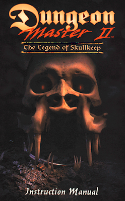
Dungeon Master II: The Legend of Skullkeep
United StatesFTL Games (developer); Interplay Entertainment (publisher)
Released 1993 for PC-98; 1994 for FM Towns and SEGA CD; 1995 for Amiga, DOS, and Macintosh
Date Started: 15 August 2022
It's hard to count the number of Dungeon Master-inspired games that I've played since the 1987 original almost 12 years ago: the Eye of the Beholder series, the Abandoned Places series, Black Crypt, Knightmare, Captive, Arcan, Towers . . . there must be three or four more. We even saw a top-down adaptation with DarkSpyre. Few of them have rivaled the perfect blend of real-time combat, focused character development, and mechanical puzzle solving as the original. There have been clones that dealt with what I thought were weaknesses of the original--no economy, impenetrable equipment data, poor story--but not without sacrificing something from their progenitor. By 1993, fans must have been rabid for a sequel.
Unfortunately, unless they were Japanese, they had to wait another couple of years. For some reason, FTL, a San Diego-based studio, decided to develop the sequel for the PC-98 first. (And for some reason, the Japanese version lacked the words "The Legend of" in the subtitle. I'll try to sort these questions for the final entry.) The result is that the 1995 DOS port I'm playing feels almost premature. It has noticeably better graphics and sound than the 1993 games I've been playing. Still, many of the game's elements seem already dated for 1993 and particularly so for 1995. I doubt the two-year delay did FTL any favors when it came to U.S. reviews.
 |
By the power of Skullkeep!
|
The backstory for Skullkeep has nothing to do with the original Dungeon Master. I'm not even sure they're set in the same world, which here is called Zalk. Skullkeep is a long-abandoned fortress on a remote island, rumored to hold the remains of some kind of machine called the Zo Link. A young warrior named Torham Zed has been sent to the island by his uncle, Mylius, who serves on some kind of governing body called the World Council. Torham discovers that evil is stirring in Skullkeep. Weird, evil little orbs keep teleporting into the world "from the Void" and then flying directly into the castle.
Torham meets an old woman who initially mistakes him for Mylius. Just before one of the orbs kills her, she talks about someone trying to "cross the Void" and enter the world, and she begs Torham to put the machine back together, use it to somehow cross the Void himself, and "attack him there before he attacks us here!" Torham's problem is that Skullkeep is sealed with a lock that requires four keys, and no one knows where the keys are.
As far as I can tell, nothing has changed when it comes to Dungeon Master's character classes and methods of character development. Every character is some mix of fighter, ninja, wizard, and priest, with their strengths indicated by ordinal levels in each of those classes. The first four levels are, in order, neophyte, novice, apprentice, and journeyman. As with the original, you don't create characters but choose them. Torham himself is a non-negotiable member of the party. He is a fighter first (apprentice), priest and wizard second (novice), and a ninja last (neophyte). He begins with a dagger, leather armor (jerkin, pants, and boots), a canteen, three gold coins, a silver coin, and a gem.
Gameplay opens with Torham in what the manual calls the "Hall of Champions," but which just looks like a bunch of caves. There, Torham can walk up to a variety of what looks like cryo-stasis machines and view the inventories and statistics of the occupants. (This sequel, in both the backstory and in-game graphics, seems to suggest a greater fusion of fantasy and science-fiction than its predecessor; there were times during the opening hour that it reminded me of Perihelion.) There are 15 potential champions to choose from, each with different stats (strength, dexterity, wisdom, vitality, anti-magic, and anti-fire, plus maximum health, stamina, and mana), levels, and inventories.
 |
I'm not looking at that face for dozens of hours.
|
The champions don't have explicit races. Most of them are human, but Het Farvil has weird hair that suggests some plant DNA. Equus, despite his equine name, looks like a bull, albeit with horns pointed in the wrong direction. Bane Blade Cleaver is some kind of goblin. I have no idea what Cletus is--a monster with facial horns and a third eye or gem in the middle of his head. Anders Light Wielder has pointy ears.
I went with Cletus (primarily a fighter), Seri Flamehair (primarily a priest), and Saros Shadow Follower (primarily a wizard). You can rename all the heroes, including Torham, once they're in the party, although I didn't. There's an empty chamber, presumably for Torham himself, although this conflicts a bit with the backstory.
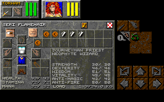 |
Seri Flamehair has a couple of good statistics.
|
The interface is mostly unchanged from the first game, with just a bit more style and ornamentation to some of the buttons. Unfortunately, this extends to the use of the keyboard, which again offers nothing except movement and the use of number keys to see character portraits. The only major change is the fusing of the attack, formation, and spellcasting elements into a single complex panel. Apparently influenced by Eye of the Beholder, the panel now depicts hands when the character is unarmed and the regular weapon icon when armed. You can dual-wield, which I don't think was possible in the original. More on magic and combat later.
The inventory screen is entirely unchanged. Almost immediately, I get annoyed by the inventory system all over again. Saros has a "Cloak of Night." What does that mean? Cletus has an "Illumulet." Does that provide light? Nothing seems to change if I take it off. Then again, I remind myself, I probably would have had the same objections to Eye of the Beholder except that I'm more familiar, from other games, with what standard D&D magical items do.
One minor change is that a sound option has been added to the inventory screen, with the ability to adjust the volume of sound effects and music independently. This is one element that makes the game feel more like it exists in its port year of 1995. By 1993, not only do few games offer the ability to mute music without muting sound, hardly any game has volume settings for either. Being able to lower the music volume without muting it means I'm less likely to turn it off completely. In the caves, the music was unobjectionable anyway--more atmospheric than melodic (again, I can't help but compare it to Perihelion, although I realize there's little chance of any direct influence). This changed on the next level, with a highly repetitive and annoying (to me) melody, and the music went off. I'll periodically give it a try in later areas.
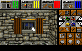 |
I had a lot of paragraphs with no images in between, so here's a shot of a window where you can click on the curtains to open and close them.
|
As I move around, I notice an unwelcome interface element. Perhaps in a nod to the growing influence of continuous-movement games, Skullkeep introduces a half-step when you move forward. You don't have to hit the forward key twice or anything; the game just automatically moves you half a square, then half a square again. I find it as awkward as the transitions used in Lands of Lore, but at least there you could turn it off. The stuttering is not there if you strafe. I find myself wondering if this is going to affect the famous combat waltz.
The Cave of Champions is a small 5 x 8, so I don't bother to map it. I had an entire paragraph here where I noted that the lack of an automap, while not particularly bothersome to me, was unusual for 1993 and particularly for 1995. Then I discovered the game does have a map of your surroundings, in the form of a "magic map" that you find on the next level. I do enjoy mapping, but I've also just come off a few long games that required it extensively (not to mention the aborted Tygus Horx), so I might see how far I can get without mapping, at least for the introductory areas.
A ladder leads up from the cave to a stonework room with a couple of exit doors. Here, not only are the game's improved graphics on display, but also some interesting new interface elements come to light. It looks like you can click on a lot more things in the environment (alas, not with any Lands of Lore or Beholder-style commentary from your party members), and some items you can even move. For instance, this room has a table blocking access to a painting. If I click on the table, I can pull it, push it, or move it left or right to get access to the painting.
 |
Moving a table around the room. Because I can.
|
The table has a canteen (technically, a bota) and a gold coin. A lot of my characters started with gold, silver, and brass coins, and the manual has already alerted me that Skullkeep will have shops and an economy. Behind the painting, I find the magic map (which looks presciently like an iPad), a sack full of food, and a money box where we can put all of our coins and gems without having to take up individual inventory space. Brilliant.
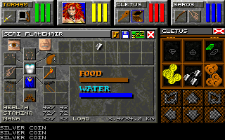 |
I mean, the game could have just had a "gold" statistic like any other game, but this works fine, too.
|
The room also has a chest with a couple of potions, plus a "solid key" that I barely see against the grey stones. Containers are a bit weird. It appears you have to put them in your hands and then open them from the combat panel rather than the inventory screen, although you can drag things to and from them from the inventory screen. It's not necessarily a problem, but there are a lot of ways in which Skullkeep reverses the conventions of similar titles, and in the opening hours, I constantly find myself clicking on the wrong things, or right-clicking when I should be left-clicking and vice versa.
The adjacent room to the east has a window with curtains that you can click to open and close. This has no functionality, but I still find it delightful. There's an altar in the room with a scroll on it. It takes me a while to read the scroll because I'm used to the Beholder way of putting it in a hand and clicking on it. Instead, what I want to do is drag it to a character's "eye" icon and hold down the mouse button. Anyway, it says: "Renew the life of a fallen champion." This is clearly our resurrection altar.
The key opens a northern door, which takes us to a short hallway that ends in an arch leading to the outdoors. Here, we find our first enemy--some kind of blob with two glowing eyes, blocking the path. As usual, it annoys me that in this series, you can't tell what anything's name is.
 |
My first foe. He's facing to his right here, so we only see one eye.
|
Combat works by left-clicking each character's weapon (or bare hand) in the combat panel, at which point you get a small menu of options specific to the weapon. For instance, with a dagger, you can slash, stab, or throw. A club lets you bash or throw. Bare hand options are punch and kick. Only the characters in the front row can attack enemies in front of you by default. When you click on a weapon, you also get a little panel that lets you change the orientation of the character, allowing them to attack to the side or rear, I guess if you were flanked or surrounded by enemies. In Dungeon Master and Chaos Strikes Back, I found that I could use this effectively by orienting the two rear characters to the rear, then spinning the party around and having them attack while the front characters cooled down. Unfortunately, that's not possible here, since the moment you move or turn, all characters snap back to a forward orientation. I don't know why the developers introduced that; maybe they thought what I was doing was an exploit. The only way the rear characters will get combat experience is if I change party positioning, which to be fair isn't that hard.
 |
Some of the outdoor graphics.
|
There are more blobs as I move forward, but I find they're as likely to move away as they are to fight me. The outdoor area is initially just like an indoor dungeon, but with bushes instead of wall textures, but it soon gives way to a large, open area. There's a thunderstorm going, with associated graphics and sound. Soon, I'm mapping again, though I promise myself that I don't need to annotate every treasure this time, just major locations, stairs, and puzzles. I force myself to adopt the leftmost wall pattern that I talked about in Eye of the Beholder III although it still feels so much more natural to go right.
There are a lot of rocks and branches on the ground, and even a scythe and a staff. I soon find myself in an area with some kind of mosaic on the ground and a sign with an image of a sword on the other side. I note a similar sign in the square ahead of me and realize it is marking the entrance to a shop. The first one I encounter is an armor shop, complete with a guard standing in an alcove as I enter.
 |
Am I meant to interpret this as some kind of technology, or just an interface abstraction?
|
I have to read the manual to understand how buying and selling works. There's a display on the wall that scrolls through what the shop has to offer, along with the buying and selling prices for those items. To buy something you scroll to the item you want, then side-step to a table to the right, where a shopkeeper presents the item on his side of the table. You then load up your side of the table with coins or items of value that he might want. Once equity has been reached, he spins the table and you take your item.
 |
I'd rip this guy off, but he shrewdly blocked the way with a table.
|
If you want to sell something you step to the left table, but I can't get it to work, not even with armor. I put stuff there but nothing happens. Supposedly, putting your money box on the table also gets the shopkeeper to convert your lower-value coins to higher-value ones, but nothing happens for me. While I'm trying to figure it out, instead of putting my money box on the table, I accidentally send it sailing across the table to bonk him in the head, something the manual specifically warns against. He turns around and walks away as his guard shows up to kill the entire party in about three seconds. Thus do I get my first glimpse of the "full party death" screen, which is just an uninspiring "THE END."
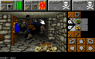 |
Don't mess with loss-prevention officers.
|
I think I'll wrap up for now and figure it out next time. Classes are about to resume, and if I increase my playing-to-blogging ratio, I can get more material out of less game time and thus reduce the chances I have to take a break from the blog.
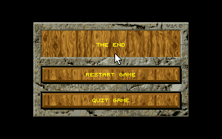 |
They didn't work very hard on this screen.
|
In writing this entry, I had to look over many of my old Dungeon Master entries, and I can't tell you how embarrassed I am, twelve years later, at my coverage of that game. I clearly had no sense of its place in history and no appreciation for how it differed from other RPGs. In nearly every entry, I mention the possibility that I'll quit the game at any moment, clearly without realizing how horribly it would have hurt my credibility if I had done so. I don't really like the idea of replaying games I've already completed (I seem to have abandoned my Pool of Radiance series), but I probably need to revisit that one and give it proper coverage.
Time so far: 1 hour


The wooden textures under the action buttons are doing the UI no favors.
ReplyDeleteTo be fair, early-90s websites also put arbitary textures pretty much everywhere. I guess it was just fashionable at the time.
DeleteI find everything about the UI pretty awful. Those primary colour bars are garish.
DeleteThen again, given the title screen there was little chance of a visually coherent game.
Minimalism came much later if you could have wood textures and 5 diffent fonts in one picture it was a cool move to show it of
DeleteI think back fondly on Baldur's Gate I's stone and parchment UI at the same time that I acknowledge I would never put up with that today.
DeleteTo be fair, using bold, primary colors in the UI makes it easier to read. That's almost an ahead-of-it's-time design decision. I don't find it particularly aesthetic, but it works. The wood, on the other hand, isn't in the same visual language and make the icon harder to read.
DeleteOn the other hand, having three unmarked red bars that (presumably) mean three different things does NOT make it easier to read.
DeleteYou just have to figure them out by position. The colors are associated with the character. Same colors for the bars and the characters in formation. It could have been a nightmare for me, but I can actually distinguish those colors (if not accurately name them).
DeleteI thought that DM 2's UI was a little bit worse than that of DM 1. Years ago I compared the number of clicks to do things in both games and if I remember correctly, in combat the player often had to make a few more mouse clicks in DM 2. I think the reason is that DM 1's UI has the spellcasting menu open all the time.
Deletehttps://www.mobygames.com/game/atari-st/dungeon-master/screenshots/gameShotId,64063/
What I find confusing about the interface is that the items in everybody's hand are shown on screen twice: once at the top of the screen, once at the right. I'd say it would have been clearer to have ONE box for each character, instead of TWO boxes.
Delete"...seems to suggest a greater fusion of fantasy and science-fiction than its predecessor..."
ReplyDeleteI mean, we had this discussion before (probably during one of the Might&Magics), but the mixing of fantasy and sci-fi elements instantly breaks my immersion, takes me out of the game, and makes no sense however you look at it.
Oh no, your fiction got some fiction in it.
DeleteOkay, I'll bite...
DeleteI assume you guys are pretty happy about being able to search GOG and Steam down to very specific tags, keywords and sub-genres. Now imagine a bookstore only differentiating between fiction and non-fiction.
There's more to an accomplished fantasy than mashing together made-up stuff, just ask anybody seriously writing one.
I think they did a pretty decent job mixing different fantasy settings and sci-fi in Star Ocean: Till the End of Time.
DeleteFunny how tastes differ. Settings that combine fantasy and sci-fi excite me and instill a sense of wonder because anything is possible. Is this ancient high technology or magic? It's exciting to find out!
DeleteI write short stories and recently sold a scifi-fantasy mashup to cirsova, a pretty big neo-pulp magazine. The editor loved it for its imaginative setting and exciting action. And I would say that I made sure that immersion is never broken and the SF/F work together perfectly.
If it's done well, fantasy with elements of sci-fi is my absolute favorite setting and I'm really disappointed by how in games especially there is this clear-cut divide between the two. Games like Wizardry 6 to 8 or the M&Ms are very rare nowadays, it's either full fantasy or full sci-fi.
But with good worldbuilding there's nothing silly whatsoever about mashing the two together. A fantasy world with ancient/medieval technology can have wrecks of spaceships and ancient buried cyber-cities and still keep its tone consistent. Adventurers stumbling upon a city built by spacefarers centuries ago, but they lost contact with their home planet and didn't have enough people to sustain their high tech society. Some high tech systems still run on backup generators and wizards pay a high price for these "arcane" artifacts...
This kind of stuff will always excite me more than puritan fantasy that strictly follows its own conventions. It adds a wonderful element of unpredictability to a genre that has grown stale (especially in gaming, where fantasy is usually extremely conventional; literature is thankfully a little more experimental).
I'm so extremely bored by predictable generic elf-dwarf-orc-fests that any breath of fresh air is welcome. And sci-fi elements are very fresh.
Eh. It's a simulation. It's far future. It's far past. Makes as much sense to me as Fantasy and Sci-Fi separately.
DeleteImagine having so little tolerance for anything outside modern genre norms that a robot in your sword world would make you throw a fit.
DeleteIt's a travesty, to each his own, I guess...
DeleteFantasy is almost inherently post-apocalyptic. Most of the progenitor works are built among the ruins of an ancient power (probably inspired by legends of Rome), and more than a few of those had that lost ancient world be an advanced version of our own.
DeletePutting sci-fi in fantasy should be no more immersion breaking than putting wizards or dwarves in.
Traditional fantasy by itself is overwhelmingly bland and unoriginal - oh look, dwarves and elves again, what a surprise - so I for one welcome a little science fiction to spice it up a bit. It's like adding a splash of hot sauce on a plain baked potato.
DeleteI really don't get how anyone can hate the extremely radical van-art image of a barbarian fighting space aliens with a ray gun. It is unironically totally sweet every time.
I would say the problem here is more that they don't pick one and stick to it, half-arsing it just gets you the worst of both worlds. The Auto map and the cryo chambers here don't fit into the rest of the world which seems more traditional fantasy.
DeleteI don't mind if the two are mixed, just do it well and make it clear that the content will include both, I don't want to get half-way through a traditional fantasy and suddenly a random robot shows up. But if I've been running into abandoned old tech all the time it fits fine and the immersion isn't broken.
Yes. If traditional fantasy is bland and original, then so is traditional scifi, and mixing two kinds of bland doesn't make it any less bland. Mediocre writers won't really get beyond this point, but an actually skilled writer can pull off a new and refreshing spin on fantasy OR scifi OR both.
DeleteYes, people who are easily bored and crave novelty love this sort of thing. They love breaking boundaries, mixing things together, and making a big mess. Then they move on to the next thing, because they're easily bored and crave novelty, and SF&F mashups are old hat.
DeleteIt's just not believable that a medieval iron age culture would have ray guns. Yeah, you can use the "a wizard did it" excuse (or its cousin, "aliens did it") but it doesn't make it any less naturalistic. It's just as jarring as when characters use net.slang. The hero faces off against the villain: "LOL get rekt" "No U!"
It's like having a nice bottle of red wine and a can of artisan energy drink. Mixing them together detracts from both.
I really don't think this is a subject where the Big Five model tells us anything useful.
DeleteJack Vance's spirit would like a word with you. ;)
DeleteOne of Karl Edward Wagner's "Kane" stories sprinkled some scifi into the fantasy and that worked quite well, so it's at least possible.
DeleteI mean, if it's bland generic fantasy without anything interesting about it (just your regular elves and dwarves land with a plot about an evil overlord or something) there isn't much immersion for me in the first place and the presence of sci-fi elements that don't seem to fit can't ruin much in that regard. They can add some spice though which is always welcome for that type of bland fantasy.
DeleteI also really love oldschool pulps and the sword & planet genre, so mixing swords and rayguns in the same setting feels totally natural to me.
I agree. But note that "sword & planet" (such as Flash Gordon) is not the same as "take a stock Tolkienesque fantasy and add robots".
DeleteIt is, though. Big Five personality traits can tell us a lot. Once you know how to spot high Openness people, they jump out everywhere. A hallmark of high Openness is getting bored quickly and the constant desire for novelty.
DeleteOriginality is overrated. Who cares if the story has dwarves and elves, as long as it is good? We can’t assign originality as a measure of determining worth. So much of art is about blending, recombining and sometimes borrowing traditional ideas and genres to create in ways that we haven’t always thought about before, and it’s time to loosen up on our definitions.
Don't worry about the Big Five regarding Harland, he's permanently stuck on the "Big One" model. Are you a high or low Openness person when you filter everyone around you via the concept of Openness?
DeleteAs has already been suggested, it all depends on the world building. I too would be confused and disoriented by the sudden and seemingly arbitrary inclusion of robots and ray guns in what had previously been a well-developed fantasy world. But the sudden inclusion of robots and ray guns in a low-thought, thrown-together fantasy setting--i.e., the setting of many a CRPG--is not a big deal. It likely would not break my willing suspension of disbelief because I never suspended my disbelief in the first place.
DeleteFrankly, at this point I'm more alarmed by the presence of shops in the dungeon than I am by a few hints of technology.
Scifi elements in fantasy aren't inherently intrusive, but the kitchen sink approach to fantasy worldbuilding (eg most rpgs on this blog) is made even worse by tossing in robots and ray guns.
DeleteNinja'd by Anon#437
DeleteI'll try to throw an extra wrench in here by suggesting that for the most part, Sci-Fi and Fantasy are not genres at all -- they're just settings. Isaac Asimov showed decades ago how in a sci-fi setting one can have a treasure hunt, an historical epic, a murder mystery, what have you. Lately my wife has been really into murder mysteries in a Fantasy setting; in my mind that belongs on the shelf near Dorothy Sayers rather than near Brandon Sanderson.
DeleteI'd say one game that does this fairly well is Might & Magic III, where you start exploring a fantasy world and eventually discover it's actually a spaceship.
DeleteOn the other hand, a game that does it poorly is Might & Magic 4, which is a stock fantasy setting with generic evil overlord, except the last castle contains robots with no explanation given.
I thought that DM II has a pretty coherent and atmospheric mixture of fantasy and a bit of technology. It doesn't feel like sci-fi to me, merely like there are some rusty technological/magical machines.
DeleteAdmittedly biased from involvement with stuff like Numenera, I'm all in favor of 'Science Fantasy' mixes--if done well. As Arthur C Clarke put it, “Any sufficiently advanced technology is indistinguishable from magic”. On the other side of the coin, Brandon Sanderson's systematic approach to magic is more like hard sci-fi than Star Wars 'space magic' is. Where one genre ends and the other begins is more about their approach to storytelling than about their most common tropes.
DeleteI see two arguments for the "don't mix fantasy and sci-fi elements" side here.
Delete1) "It's just not believable that a medieval iron age culture would have ray guns." True but incomplete: the more you add fantasy elements, the less you have a "medieval iron age culture" either. Technology is culture-defining; so is magic. If one is vastly stronger than the other the other is unlikely to develop. So there are worlds like Eberron, where magic occupies the role technology does in some other worlds, and worlds where magic and technology are separate and comparable in power, and worlds like Shadowrun where magic affects technology, but few if any worlds that have "magic exists and can't do much; technology exists and can do easily more." Real "medieval iron age cultures" are all but unknown in fiction because "realism" means lots of things very few people actually want to deal with.
2) "I just hate it" (sounds like a you problem) "and it reflects badly on anyone who doesn't" (...and sounds like you actively don't want my sympathy, so, congratulations on not getting it).
The argument is more that technology has prerequisites and side effects: if a setting has rayguns, then logically it should also have (e.g.) electric lights and radio communication, so why does everybody still use torches and carrier pigeons?
DeleteFor instance, Larry Niven's The Warriors shows that following the laws of physics, any society with access to stellar travel by necessity has access to highly destructive weaponry (because what do you suppose happens if you point a stellar engine at a cityblock?)
Of course there ARE ways in which a writer can explain such things and remain believable, but the issue is that numerous writers mixing futuristic and ancient elements just don't seem to think about that, and that can break suspension of disbelief.
"medieval" and "iron age" are distinct periods in human (pre-)history, and I'm pretty sure most fantasy worlds are pseudo-medieval at best.
DeleteI don't think believability is the issue (for some people, certainly not me), but rather the clash of styles. Fantasy where magic just works, and science fiction where you expect an explanation, however stupid it is.
Shadowrun is first and foremost a cyberpunk world, and it makes an effort to integrate fantasy into the science fiction setting, which I think is why it works pretty well. That includes explaining why magic works.
When people talk about "believability" they usually mean internal consistency of the work, not so much whether it could happen in real life.
DeleteFor instance, magic that follows some manner of rules (even if they aren't fully explained) is more "believable" then magic that simply does whatever the plot needs at the moment.
There is otoh a rather wonderful story I read recently (I'll try to track down the title) which posited that ftl is actually quite easy but it is a technological dead end with no other applicability and humans just happened to miss it. But once a species discovers it, they put all their efforts 8nto space travel. It's told from the pov of the galaxy's greatest imperial power, getting ready to conquer Earth, an obviously backward planet that doesn't 3ven have ftl yet (though we wonder what the deal 8s with those brightly lit areas, far too big and bright to be man made cities...). They land, empty their chamberpots, load their flintlocks, and disembark to meet the US army with machine guns and jet fighters and electricity. The story ends with the invaders growing horror as they realize that the only thing stopping humans from massively overpowering every other race is that they missed out on ftl, and now they have a ship to study
DeleteOr as TV Tropes would put it, the trope "Magic A Is Magic A" leads to substantially less plotholes than the trope "A Wizard Did It".
DeleteGenerally speaking, most fantasy games are vaguely medieval Germanic worlds that somehow have plate armor yet curiously missed out on flintlocks. Technology requisites doesn't quite add up. Plus, since you have wizards, you could always call ray guns, magic crossbows, and robots, metal golems.
Delete@Ross
DeleteThe story you are thinking of was "The Road Not Taken" by Harry Turtledove.
Ridiculous that this is still up for debate. Anyone who “can’t believe” anyone would like ray guns and swords needs to read something from before the 1980’s ffs. Also I sure hope they hate Star Wars.
DeleteI think I agree that a lazy kitchen sink setting is even more intensely boring and disengaging than someone just copying Tolkien. At least the latter can be vaguely cozy. The game isn't actively telling me "whatever, this is all dumb nonsense."
DeleteI'm a big fan of actual well-developed inventive settings, though. For a recent example, see Katherine Addison's The Goblin Emperor and its sequels, which is sort of steampunk-ish with light fantasy elements, and it works incredibly well.
That's a good point actually. A writer that goes by the principle of "it's all magic anyway, I don't need to explain sh*t" is telling us that his setting is "dumb nonsense" and he doesn't really care about it. So why should the reader?
Delete(unless it's a deliberate parody, of course)
@Gnoman @Ross well thank you for ruining my first hour of work, that is a perfect example of doing it right
Deleteyeah, I think "internal consistency" ist the magic word. Ray guns as a renmant of lost civilisation and nobody knows how they work and if they brake or have an empty battery became useless are cool in my book.
DeleteBut it's kinda a bit with expections, if it toys to much with it I can see how it's can affect the reader negativly. When you expect a high fantasy story and there are ray guns, for some it's a cool twist and for some a stupid trope
Your story of making the rayguns a remnant of lost civilisation IS an attempt to make them internally consistent in the setting!
DeleteThere have been both insightful comments and unnecessarily rude comments in this thread. Overall, I like the conclusion we've seemed to reach: blending sci-fi and fantasy elements is okay as long as there's a sensible reason that the two elements could exist in the same universe.
DeleteAlthough I admire the synthesis we've reached, I feel compelled to say that I still prefer them separate. But maybe that's because there aren't a lot of examplars of good storytelling and sensible backstories that make the blend work.
There are very few examples indeed when we look at CRPGs, but in the realm of literature there is some really good stuff (including my own upcoming story, to do a little self-plug :p)
DeleteSF elements in fantasy were not uncommon in oldschool fantasy and have made a return recently with the pulp revolution. I greatly enjoyed the stories of Schuyler Hernstrom, many of which combine classic sword and sorcery with sci-fi elements. Images of the Goddess is one of my favorites, but his Kyros and Mortu stories are also great.
Jack Vance's Dying Earth is a classic that works with this theme, but the SF elements there are not very overt. It's like a much more subtle Numenera. The concept of a fantasy world that's actually Earth in a far post-apocalyptic future is as old as the genre itself. Clark Ashton Smith's Zothique comes to mind, although it has no sci-fi elements.
Marion Zimmer Bradley's Darkover series is pretty much fantasy with a scifi backdrop. It clearly has magic, but also galactic empires and spaceships. The plots often feel more like fantasy than sci-fi.
Medieval fantasy actually fits quite well with lost super-technology when you remember that the concept of the Middle Ages (more than the reality perhaps) is based on Europe after the collapse of the Western Roman Empire. Of course the Romans didn't really do super-technology except maybe in construction, but the spirit of a fallen society with secret lost knowledge is inherent in the medieval theme.
DeleteI don't have much to add to this great discussion, but I'd like to say that I loved the way Pillars of Eternity's sci-fi elements blend seamlessly with the fantasy. If you squint, it's hard to tell where the fantasy ends and the sci-fi begins. It's a shame everyone seems to hate those games now.
DeleteSee, I didn't even notice Pillars had sci-fi elements. I barely remember anything about the game other than quitting it halfway through due to getting bored.
DeleteYep. The first two acts of the first game are pretty boring, but it gets much better after that. And the expansions are great. PoE 2 is solid throughout. The sci-fi elements are present throughout, but very little attention is drawn to them early on. They're just presented as a different kind of magic.
DeleteWhat are these sci-fi elements in Pillars of Eternity?
Delete"Remnants of a technologically advanced ancient society" works so well with medieval fantasy settings that it's become an inescapable cliche. Hell, it's a cliche in sci-fi settings at this point. I have a list of "dos and don'ts" for the game I want to make someday, and one of the "don'ts" is "no Precursors".
DeleteBitmap
DeleteSpoilery, so rot13:
Gur fpvrapr va CbR'f fpvrapr svpgvba vf navznapl - gur fpvrapr bs zrgnculfvpf. Yngr va gur svefg tnzr, lbh yrnea gung gur CbR tbqf jrer ohvyg bhg bs gur fbhyf bs beqvanel crbcyr. Infg dhnagvgvrf bs fbhyf jrer (zrgncubevpnyyl) tebhaq hc vagb onfr fbhy-fghss naq hcplpyrq vagb qvivar orvatf hfvat znpuvarf ohvyg nppbeqvat gb cevapvcyrf bs gur jbeyq'f zrgnculfvpf. Gur tbqf znavsrfgrq nppbeqvat gb gur zlguf naq yrtraqf bs gur crbcyr gung jrer hfrq nf onfr zngrevny. Gur gvghyne Cvyynef bs Rgreavgl ner pbzcbaragf bs fbzr bs gurfr znpuvarf naq pbaqhvgf sbe punaaryvat fbhy-fghss. Gurer'f n ybg zber gb gur fgbel, ohg vg'f n qrprag gjvfg gung er-pbagrkghnyvmrf n ybg bs jung lbh frr naq yrnea rneyvre va gur tnzr'f aneengvir.
In my opinion there is little conceptual distinction between what is commonly called sci-fi and fantasy. They are both fantasy to me. In any case fantasy is better if there is self-consistency.
DeleteI'm looking forward to Chet someday playing Torment: Tides of Numenara.
DeleteThere are few things I recall from my time with Dungeon Master II, but the rotating vendor tables and oblique currency system are definitely two of them. I kept wondering when the game would force me to negotiate for the antidote to the poison I just drank.
ReplyDeleteI don't remember getting too far with DM2, but I was getting all sorts of deja vu from playing Legend of Grimrock 2 (which is implicitly based on this particular Dungeon Master) so I'm hoping more of that triggers as I re-live it vicariously through your coverage.
I love DM2 but couldn't stand LoG2 (or 1 for that matter). Quit at that first boss fight that i simply couldn't manage to win
DeleteI liked that they put in vendors but I think the whole system is cumbersome and overly complicated and I think you could sell stuff you just have to wait for the vendor to walk around and come to the other table.
ReplyDeleteI have a vague recollection that to trade you put stuff on the table and then turned the table - but Ksmb could just as easily be right.
DeleteI agree that the system is overcomplicated, but from an immersion/stylistic standpoint it's kind of cool as it implements a shopping system without the need of a specific modal screen or menu for it (as every other first-person CRPG I can think of does), allowing the player to nevel leave the main view.
DeleteAs cumbersome it is, it also adds a more interactive and "tactile" feel to the process.
Overall not worth it, but an interesting evolutionary dead-end nonetheless.
I think experiencing these diegetic, hidden menus can be very nice for the first time, and then quickly become annoying. Just like those slow DVD menus, or those Codemasters raging games. In-game functions should be quick, especially if you use them all the time.
DeleteIn fairness, there's not that much trading throughout the whole game, so the whole vendor interaction is, imo, worth it
DeleteYeah the whole trading seemed like a good idea (different shops even sell at different rates so you could make money if youre so inclined) but its not used - I traded next to nothing. Generelly DM II had some good ideas, but a lot of them seemed to be sub-optimal implemented and often more annoying than interesting unfoirtuently.
DeleteThe trading in DM2 is the best. There are good items to buy which cannot be found in the game otherwise and there are cool ways to make money to buy those things. Also to slowly change those beginners copper coins for those high level gemstones through the powers of 2 (or is it 4?) is satisfying in itself.
DeleteSo far, I'm where Vince and Jiha are. I wonder if my opinion will change later in the game.
DeleteI belong to the people that like the way trading is implemented in DM2. It's consistent with all other interactions with the game world being from the first person view. You can even haggle by putting less money on the table than the item's listed price.
DeleteDrat, I was going to bring up the whole Japanese-exclusive for nearly 2 years part. Considering the meme status of titles like Duke Nukem Forever, The Last Guardian and others, I have to wonder if DM2 held the same status back in the day, and the passage of time has ruined that aspect to us. Since 6/8 years for a game is hardly shocking anymore.
ReplyDeleteIt's a strange move considering how impactful the first one was and at 95 this felt ancient
DeleteMy first thought about PC98 and Sega CD versions coming out before the DOS/Amiga/Mac versions was that publisher Victor Entertainment had paid for some amount of exclusivity. Victor or their parent JVC handled many of the Japanese computer and international console releases.
DeleteHowever, it does seem like DM II was just terribly delayed on every other platform. Edge #1 for 10/93 has a preview with a release date of November ’93, but it’d slipped to Q1 ’94 by Edge #2. It even mentions that the Sega/Mega CD version might come out first!
It didn't really hold anything like that status - it was just considered too late, and not innovative enough considering the delay. A a game there's nothing much wrong with it.
DeleteI believe FTL decided to make all the different version in-house, instead of focusing on one platform and subcontracting the ports to other devs, as it was usual for small studios.
DeleteYou also have to question the wisdom of investing time and effort in an Amiga version, when the platform was already on its knees in 1993 and completely obsolete by 1995.
It seems to be a combination of questionable management decisions.
Still it's telling of how blazingly fast the technical progress in games was at the time: Red Dead Redemption 2 is 4 years old by now, Witcher 3 is 7 yo, Skyrim is 11 yo... all of them could be released new today with minimal graphical updates and still be smashing successes.
For me FTL were always the kings of bad business choices. Releasing Sundog on Apple ][ in 84 and making a 16-bit conversion years later only for the AtariST? Steve Bak would've coded them an Amiga port (and maybe QL, too) within 2 hours - won't ever see the logic in this. Dungeon Master was an AtariST premiere, too. The Amiga port took some time and used 1MB of RAM excluding half of the target audience. The DOS version needed a special Sound dongle that everyone and his dog hated with passion. Making CSB so hard to beat must have limited their sales to the hardcore DM fans only. Releasing the SegaCD version as the first release in the western world? Crazy, because the SegaCD only got limited sales (especially in Europe) and DM had nearly no reputation on consoles - it was a (home-)computer franchise. It was okay to control with a gamepad, but clearly was made with m&k in mind. The Amiga version had a very high retail price that wasn't justified by anything the game delivered and probably put off some potential buyers.
DeleteI haven't found any detailed article about the game's development, but originally the game was developed with 16 or 32 colors, similar to DM 1, and the publisher Interplay decided to upgrade the graphics of the DOS version to 256 colors.
DeleteI'm speculating, but maybe the original version already had been pretty much finished and this graphics upgrade required a lot of additional time after the (already long) normal development time.
Interplay might not have wanted the original version to be released on other platforms before that. DOS was the main platform then, and maybe they thought that if they release the game first on Amiga etc. and then on DOS two years later, people would think that it's an old Amiga game and not bother. (Releasing it in Japan wouldn't have the same consequences because western game magazines wouldn't review the Japanese version.)
Or they thought that the new graphics and the required code changes would only take a couple of months, which blew up to two years.
In any case, I played through both the DOS and the Amiga version, and I kind of prefer the creature design of the original graphics by Andy Jaros, the same artist as for DM 1, which is a bit more serious compared to the cartoonish DOS version graphics (which are also nice, though).
Here are some nice screenshots of the Amiga version, taken off a CRT monitor. (Spoiler alert, obviously. The screenshots are at the bottom of the page.)
https://www.amigalove.com/games.php?game_id=84
This comment has been removed by the author.
DeleteHere there is an interview with Wayne Holder, president of FTL Games, from the british magazine PC Gamer Vol. 2 No. 6 May 1995 on which he discusses some of the questions you're dealing with about Dungeon Master II: https://postimg.cc/gallery/H5MFvmW
DeleteSo that is official confirmation that redoing the graphics for 256 colors was in fact the cause. The manual lists a team of additional Interplay artists that's almost the size of FTL's team!
DeleteI had a neighbor that ended up buying the Sega CD version and the mouse instead because of the constant delays. The Sega CD graphics are tweaked from the original graphics, but the redone graphics don't look *that much* better than the original graphics used for the Amiga port.
Judging from Edge, it does seem like FTL thought it wouldn't take any extra time at first only for that to balloon. There's a beta of the game floating around from summer '93 if anyone wants to check out the state of the game then.
Thank you very much, EonFafnir. Did you scan these yourself? Appreciated.
DeleteI have a lot of respect for FTL, but there are quite a few statements in this interview I'd disagree with, and yes, maybe it wasn't the best business decision to handle all these ports for 7 or 8 computer platforms by themselves. They had a great game development team, which is/was rare. Great programmers that can handle a port are/were less rare. They chose to do work that others could have done just as well, while waiting years to do work that they were unusually good at.
I can't remember the price of the game itself - I don't recall it being out of the ordinary - but Dungeon Master sold a lot of 500 Kb RAM expansions for the Amiga.
DeleteInteresting that it didn't hold the whole "forever in development" thing like later games would.
Delete(that Shadowcaster comparison in the magazine article warms my heart, even if its not quite the legend the other two are)
As to Sundog, I always figured the reason for that game's platforms were because that's what the studio owned at that time. The devs had an Apple II, which was still fairly popular at that time, and then they decided to tie their train to the ST, which wasn't as much of a success in the US, but that wouldn't have been as obvious at the time. (sort of the same with the Amiga at the same time, though its death was much sooner in the US than elsewhere) So they decided to port it to the computer they had. Then they got distracted by DM to do other ports of Sundog. All their Sundog plans god derailed by DM. Can't say I blame them.
Huh my reaction to the art was that it reminded me of the Amiga port of Pool of Radiance? in that it seems just slightly over detailed at times.
DeleteLooking at the original Japanese versions the Wood pattern on the buttons is much less complex and less distracting (to me at least). But the darker art in the dos version sets a nice mood. So I'm not sure if either of them are better exactly.
While I'm trying to figure it out, instead of putting my money box on the table, I accidentally send it sailing across the table to bonk him in the head
ReplyDelete"Audible laughter was produced".
I have fond memories of DM2. I particularly liked how the designers tried to create a consistent world, where you can observe the effects of certain actions elsewhere in the world. And I felt some of the puzzles were rather smart.
ReplyDeleteThey fixed a few issues with the UI. For instance you can in fact see (with the eye icon) the relative strength of armors and weapons; but their effects are still not always entirely clear unfortunately. Like you, I remember being confused with the mouse buttons (especially in critical moments).
> If you want to sell something you step to the left table, but I can't get it to work, not even with armor. I put stuff there but nothing happens.
Note that there are different vendors. Each will buy only certain items from you.
I hope you enjoy this one!
I don't know, I have the feeling that by the end of this game, Chet's list of most annoying enemies in CRPGs will receive a significant update :)
Delete"My first foe. He's facing to his right here, so we only see one eye."
ReplyDeleteHeh. I immediately knew what you meant here, but surely he's facing to his "straight ahead", not to his right, and you're on his left.
"Cletus has an "Illumulet."" -> somehow I initially read that as "Illumullet" and wondered what such a hairstyle looks like. Plus how it could potentially provide light.
ReplyDeleteDyed the brightest blond you can imagine (with added fluorescence). Looks like a sunrise from the front, and a massive standing lamp from the back.
Delete@JarlFrank - So, brilliance in the front, pale-y in the back?
DeleteIs he a bright slack-jawed yokel?
DeletePerhaps in a nod to the growing influence of continuous-movement games, Skullkeep introduces a half-step when you move forward. You don't have to hit the forward key twice or anything; the game just automatically moves you half a square, then half a square again.
ReplyDeleteBack in 1983, Dungeons of Daggorath did this too. (I mention this neither to refute nor underscore your main point.)
(Make that 1982.)
DeleteThis is my favorite DM-clone, and 2 things contribute to it: the merchant system, and the fact that you can summon minions to fight for you (something that i love in 3rd person RPGs, so why not enjoy them on 1st person ones?!)
ReplyDeleteA note on character selection and creation and early development: characters that start with a lower (or non existant) skill, become better at that skill than characters that already have it.
So if you start casting spells with Cletus, by the time he's a Neophyte he'll have more mana than Saros. If you go melee with Saros, by the time he's a Neophyte Fighter he'll have more str than Cletus.
I remember in particular Kol del Tac that starts with 0 mana can be a great wizard :)
That is some poor design.
DeleteI don't see why it's poor design, it just sounds like instant vs delayed gratification to me. Go with the immedately useful option that won't be as good later, or with the one that requires more investment to be useful but is going to be far better later.
DeleteBecause it is counterintuitive that the least wizardly character has the highest wizardly ceiling. Characters with different peaks in development is fine, you wouldn’t implement it in this way though.
DeleteIt seems like it might be unintentional. Otherwise, if your system's dominant strategy is intentionally immersion-breaking, I would say that's at least disrespecting the player. Breaking expectations and tropes isn't at all bad in itself, but this would seem like it's taking it too far...
DeleteThe most important stat for spellcasters isn't Mana, but Wisdom. There are some surprises, but altogether, it makes sense and the characters are balanced.
DeleteOn the shopping system: it is pretty cumbersome, but one thing it has for it is its originality. I can't remember any other game that has something even remotely similar.
ReplyDeleteOn DM:
"I had to look over many of my old Dungeon Master entries, and I can't tell you how embarrassed I am, twelve years later, at my coverage of that game. I clearly had no sense of its place in history and no appreciation for how it differed from other RPGs."
I remember from when you started to review DM being pretty surprised at how negative your mindset was when starting to cover the game. I do wonder though: it did pretty well on the Gimlet if I remember well, do you think it would score even higher today ? If you had no appreciation for its historical value there are maybe some categories where it would have scored higher ? Or is that kind of thing not really taken into account in the Gimlet ?
I would say the Arx Fatalis' system where you're directly browsing through the shopkeeper's chests is somewhere in the same ballpark.
DeleteI don't think DM would score higher in the GIMLET if I reviewed it today. It may even score lower, since I was a bit overly generous that first year. What HAS changed is that I no longer regard a 47 as a mediocre score.
DeleteNetHack. You walk in and physically interact with the shop inventory. You sell items by dropping or throwing them. You can pay the shopkeeper by dropping or throwing money. Removing items from the shop without paying for them by your direct action is theft. Destroying or using items puts them on your tab. And so on.
DeleteI'm really curious re-exploring DM2 through other eyes. I got it on release day and completed it in few sessions, but didn't replay it as often as DM. There are quite the improvements, but it's also missing a bit of the tightness DM has. I liked the shops, the remarkable areas and more interesting foes.
ReplyDeleteA shame that FTL wasn't as good in business as in creating games. This one could have been released mich earlier and DM could have been milked for yearly releases.
When replaying DM, I humbly suggest trying a fan made scenario like Imprisoned Again. I can fix the stupid level if you like.
You can see the display in the shop from the side in the second to last screenshot, so it must be an actual device.
ReplyDeleteBack then, quite a few games like Dungeon Master II were harshly critized by magazines and players when their technology and graphics were considered outdated. For example, in the late nineties, all PC games with screen resolutions of 320x200 were considered hopelessly obsolete.
ReplyDeleteNowadays, attitudes have changed quite a bit. There is a large market for indie games that have similar low-resolution pixel graphics. There's also a decently sized audience for commercial games with even more unusual graphics styles, such as ASCII letters.
You'd probably be able to find some game reviewers who decried games with 320x200 resolutions as ugly and outdated back then, who nowadays compliment such games as "delightfully retro".
How did this change come about? I liked this graphical style back then, never stopped liking it, and still like indie games of a similar graphical quality today. But quite a few other players must have gone through a phase where they disliked low-resolution graphics, only to come to like them again later on...?
Once 3D graphics ceased being the Next New Thing, people started realizing that well-drawn low-res pixel art is better than poorly-drawn (or low-count) polygons. For instance, I'd argue that by 2020s standards, the 1995 2D Rayman looks better than the 1996 3D Pandemonium.
DeleteThe real benefit of 3D was not its graphics but its gameplay potential. A game like Tomb Raider or Quake can only work in full 3D, for example, and they make great use of all three dimensions in their level design.
DeleteMoat RPGs and adventure games that used 3D didn't benefit from it at all, though.
There's been a legitimate resurgence in PSX/N64/Saturn style 3D graphics as people that grew up with those as their earliest memories start getting old enough to make games. A lot of time it's used for creepiness e.g. Fatum Betula, but there's also very sincere homages like Macbat 64. Then there's all the Quake aping FPSes plus Quake itself getting rereleased. It's only going to increase from here.
DeleteAs someone that loves that style of 3D, I'm glad I've heard of Macbat 64 now. Personally, I feel like the reason 2D made a comeback was less because of people realizing it was better than 3D and more a combination of it being cheaper to make high quality 2D assets and people that grew up primarily with 2D games becoming a large enough demographic to be worth making stuff for. I can see late 90s 3D aesthetics making a bigger comeback as the people that grew up with that get targeted, and considering Square Enix seems to have already started with their HD-2D games I doubt it's that far off.
DeleteIsn't making 3D assets cheaper than making 2D assets? For one thing, if you're rotating characters at all its much cheaper to use 3d models and animations then manually drawing each frame of movement for however many directions a character needs. Guess it all depends on how complex your use case is.
DeleteGotta say that either way I like how people are getting into making retro 3d games. When these things (2d too, remember Silmarils games) were the big trends there was a real push to make them look good for the now and not much else. Sometimes it worked, sometimes it didn't, but without much going in the game department they felt lacking.
I could be wrong on 2D being cheaper, but my understanding is that 2D assets are easier to make, but harder to scale up, while 3D assets are harder to make, but easier to work with. That being said, this is stuff I heard a while ago and 3D modeling software is cheap to free these days, so it could just as easily be a case of more people that grew up with early 3D games are getting into making games like them, and the "2D is cheaper than 3D" thing was an attempt at explaining why most retro style indie games were sprite based 2D instead of it just being that people that grew up with games like that wanting to make ones like that.
DeleteMaking good (high-poly) 3D models is not easier than making 2D sprites. The reason why 2D is easier/cheaper is that it's easier to get into: you can start with any primitive paint program and start plotting pixels, just like how you can get into drawing by just picking up a pencil and a piece of paper. Indeed, a competent pencil-and-paper artist can get the hang of pixel art pretty quickly.
Delete3D art works with specialized software and you have to get the hang of how rotations work; it's far less straightforward or intuitive how you just "get into" that.
Early 3D (the quality of Quake, Thief, Tomb Raider etc) is actually pretty cheap to make. Cost is always a result of required effort, and a decent 3D artist can produce a lot of assets in a pretty short time if you're aiming for a visual fidelity similar to games around 2000. The benefit of 3D is the ease of animation and flexibility. I'm familiar with how level design works in the Thief and Quake engines, and that's a very easy process too. Depending on what you want to go for, 3D can be much cheaper than 2D.
DeleteYes, early 3D is cheap *because* it doesn't have good high-poly models I was talking about. Seriously, Tomb Raider 1 looks horrible.
DeleteNote that we were talking about character art, not level design; that's a completely different skill.
Even high-quality 3D often tends to wind up cheaper than doing everything in 2D entirely because you only have to do it once per object. You don't have to redraw every frame of animation, or create separate "shelf, shelf with bottle, shelf with book, shelf with book and bottle" images. The initial time (and thus money) investment is higher, but it very quickly becomes sublimated.
DeleteAnonymous, you're grossly overestimating how long it takes someone to get used to a 3d modelling program and underestimating how soon it takes someone to start creating good 2d art, even pixel art. Then again, I suspect you're not being entirely genuine about this.
DeleteI find Tomb Raider 1 incredibly atmospheric, calling it "terrible" is a matter of taste but there's definitely an audience for games that look like it. (me, for example)
DeleteA big cost saver for 3D versus 2D: You only need to create each model once and each animation once, and then you can render them infinite times. If you revise the animation or the model, you don't need to manually recreate every permutation. This also makes division of labor easier, which means you can scale out art departments, which results in massive economies of scale. There's a reason that even 2D-style games often make use of 3D art underneath.
DeleteThat sounds like a reasonable assumption about 3D art, but considering the vast amount of indie/retro games in 2D as well as the amount of 2D art on sites like opengameart, it turns out that the assumption is incorrect, and producing large amounts of 2D animation is easier in practice.
DeleteBear in mind that "massive economies of scale" only apply to huge companies that can afford such scale.
In a slightly perverse twist, most retro-styled 2d games these days handle things like scaling and other sprite manipulaiton by effectively painting the sprite onto the side of a 3D object and letting the harware-accelerated 3d engine take care of everything.
Delete"Personally, I feel like the reason 2D made a comeback was less because of people realizing it was better than 3D and more a combination of it being cheaper to make high quality 2D assets"
DeleteMaybe, but there's definitely a gameplay reason for the 2D comeback. The simplicity of 2D allows for action games to be much more demanding of precision than 3D games. You can see everything happening, you don't have to manage a camera, and it's much more reasonable to be asked to perform pixel perfect movements.
For everything that is gained by 3D, some of that control is lost. 2D is better at providing certain kinds of challenges.
"...producing large amounts of 2D animation is easier in practice"
DeleteGiven a model and some props (weapon, etc.) you can create orders of magnitude more visual depictions of a character in 3D than you can in 2D. This should be uncontroversial. An individual 2D sprite is easier to create than a 3D model, sure. But there's a reason that a lot of games today that could be 2D (fixed-camera games like side-scrolling platformers, etc.) use 3D rendering instead.
I've seen quite a few indie games use animated vector drawings rather than pixel sprites or 3D models with 2D projections. Frankly I think these games often look cheap and amateurish, like everything is an articulated paper doll, but I have to imagine that this is easier than doing sprites or 3D models.
DeleteMost of modern 2D art today is made using 3D rendering. Is faster, scalable, re-usable, and you don't need to be very good at drawing. (The latter characteristics is very rare).
DeleteJust wanted to say how much I've been looking forward to this! I've noticed how your attitude towards DM has changed through the years - matured even.
ReplyDeleteIt's certainly better-informed.
DeleteIf anyone cares, bear in mind that General Midi can be achieved by using the Ensoniq soundcard option. You better install VirtuaMidiSynth or similar and get a proper soundfont (not necessarily the heaviest ones, because most soundfonts break the volumes/attack/pitch)
ReplyDelete"It appears you have to put them in your hands and then open them from the combat panel rather than the inventory screen"
ReplyDeleteWith advanced technology we will make your life less convenient, just to show you that we can! Always reminds of that motion-detecting TV where you can change channels by swiping your hand till your wrist is sore, instead of just pressing those primitive buttons on your primitive and perfectly comfortable remote control, like you have been for the past decades.
My (new) TV remote has voice command. You push the voice button, then say "TV off", then wait for it to turn off.
DeleteOr, you could just push the power button.
Wow. Just found this blog and I'm going to be tired at work tomorrow since I've been stuck reading post after post. This is awesome.
ReplyDeleteWhen reading about your annoyance over lack of names and info I start dreaming about a dungeon master or eob that adds stuff from adventure games. Places with more storytelling, puzzles in rooms but without changing the basic dungeon crawling controls. Don't know how to do it, only that I'd love it if done right.
The damage by click ONE step more and eat walls was annoying
ReplyDelete